null

Ember BigCommerce Theme

(No reviews yet) Write a Review
Ember BigCommerce theme — Home, Fashion and Food storefronts
Documentation Screenshots
£214.76
SKU:
BC-Ember

Ember — Three Storefronts in One BigCommerce Theme: Home, Fashion & Food

Ember is a premium BigCommerce Stencil theme with three variations that differ in layout, not only in colour. Home uses the Classic layout with framed product cards and a split hero, Fashion uses the Editorial layout with a centred masthead, full-bleed hero and three-across photography and opens in dark mode, and Food uses the Market layout with a search-first header, round category tiles, product shelves and recipe stories.

Each variation has its own live demo store, its own fonts and palette, and a shopper-facing dark mode — and every brand colour, light and dark, is a Theme Styles setting you can preview live in Page Builder.

Key Features

  • Three Layout Presets: Classic, Editorial and Market, switchable in Theme Styles.
  • Dark Mode Toggle: Shoppers switch between light and dark; Dark Mode Colors are their own editable colour group.
  • Mega Navigation: Category and brand panels with promo images, plus a multi-tiered sidebar menu.
  • Lookbook: Shop-the-look scenes with product hotspots.
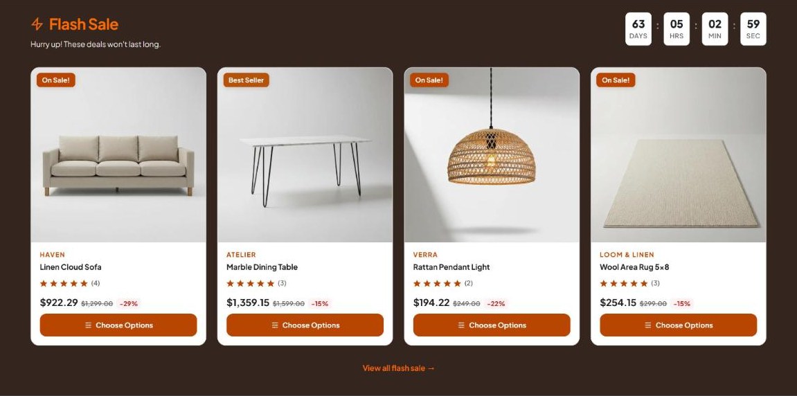
  • Homepage Slideshow & Sections: Hero carousel (uses your Storefront > Carousel slides), Flash Sale with countdown, testimonials, newsletter, brand story and press bar, each toggled in Theme Styles.
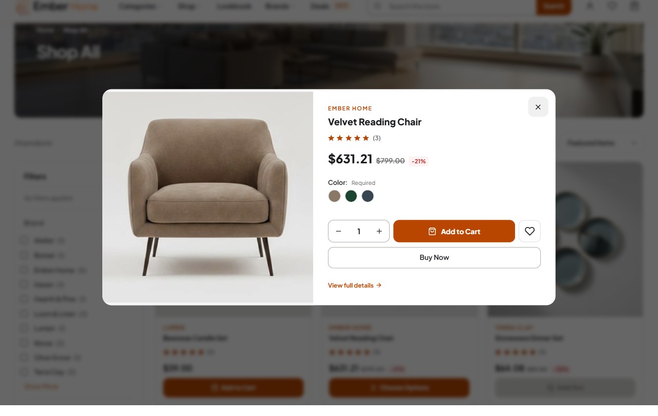
  • Quick View & Quick Add to Cart: Preview and buy straight from the product card.
  • Cart Drawer: Slide-out cart with a free-shipping progress bar and a persistent cart.
  • Rich Product Pages: Sticky add to cart, high-resolution image gallery, product videos, Q&A tab, compare and recently viewed.
  • Faceted Search & Filtering: Filters on category, brand and search pages, with a switchable grid / list product view.
  • Product Comparison Table: Side-by-side compare page.
  • Customized Checkout: BigCommerce’s one-page checkout styled in each variation’s palette.
  • Accessible & Fully Responsive: WCAG 2.1 AA contrast measured for every variation in both colour modes, one h1 per page, visible focus, and no horizontal scroll down to 320px.

Optimized For

Home & Garden, Fashion & Apparel, Jewelry & Accessories, Food & Beverage, and multi-purpose stores with small or large catalogs.

Elevate your BigCommerce store with the Ember theme. Three distinct layouts, a built-in dark mode and full Page Builder control make it a strong fit for brands that want their store to look like their own. Need help? Our dedicated support team and free theme upgrades have you covered. See the documentation to get started.

BigCommerce · Stencil Theme

Ember — three storefronts, one theme.

A premium BigCommerce theme with 3 variations that differ in layout, not only in colour — Home, Fashion and Food — each with its own live demo store and a shopper-facing dark mode.

Built on Cornerstone Light & dark mode Free support & upgrades
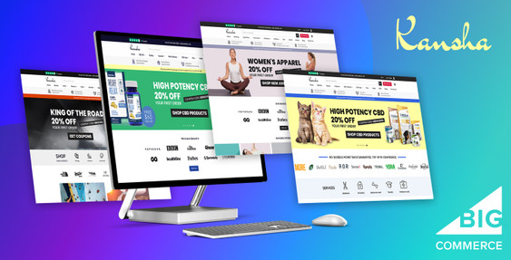
Ember BigCommerce theme — Home, Fashion and Food storefronts on desktop and mobile
3Variations
3Layout presets
400+Theme settings
2Colour modes
Why Ember

One premium BigCommerce theme, three distinct stores.

Ember is a fully-responsive BigCommerce Stencil theme built on Cornerstone. Its three variations change the layout itself — the Classic, Editorial and Market presets — so a home-decor shop, a fashion label and a fine-food deli each look like their own brand. Shoppers get a dark mode toggle, a mega menu, quick view, a cart sheet and a Lookbook with shop-the-look hotspots, and you control every brand colour, light and dark, from Theme Styles with a live preview in Page Builder.

3 themes in 1

Three variations, three layouts, one codebase.

Each variation ships with its own layout preset, palette, typography and live demo store. All three are shown below.

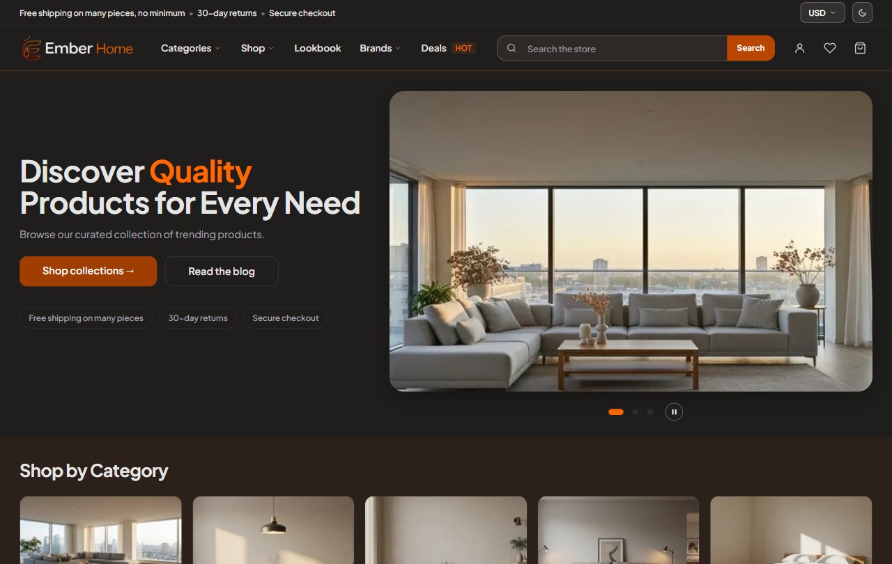
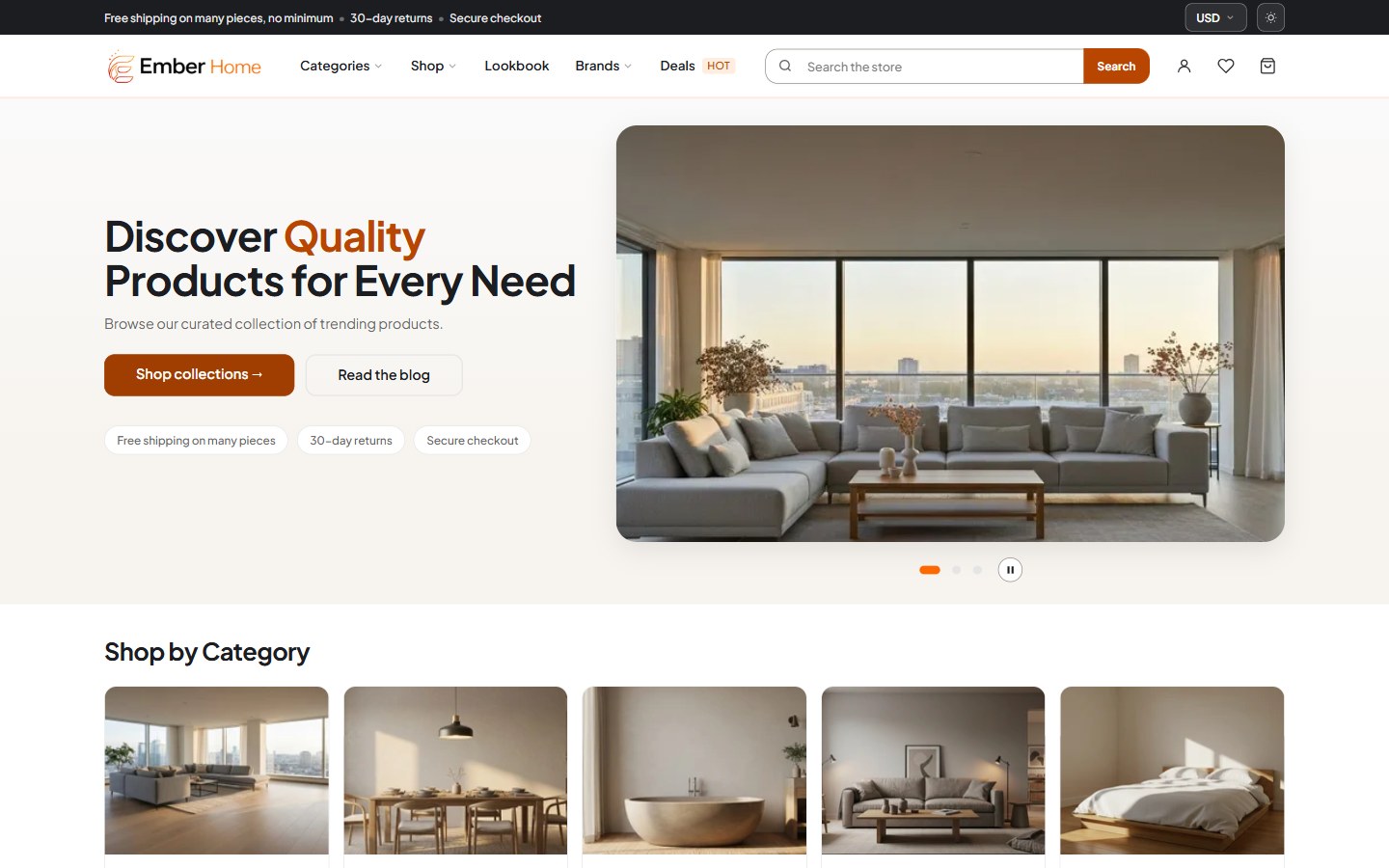
Ember Home variation homepage — Classic layout with mega navigation, search bar and a split hero with a living-room photo

Home — Classic layout

Clean and modern for home, decor and lifestyle stores: framed product cards, a split hero, Outfit typography and a warm orange accent, with a light / dark toggle.

Home & GardenMulti-purposeLarge catalog
View the Home demo →
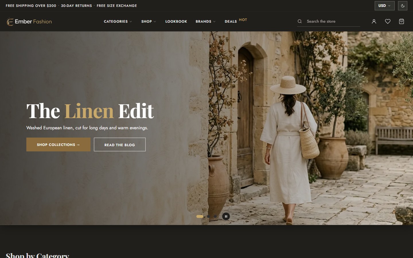
Ember Fashion variation homepage in dark mode — Editorial layout with a one-row header with centred navigation and a full-bleed linen-collection hero

Fashion — Editorial layout

For apparel and accessories: a one-row header with centred navigation, full-bleed hero, three-across product photography and square edges. Playfair Display over Jost, brass accents carried through to checkout, and it opens in dark mode.

Fashion & ApparelJewelry & AccessoriesDark by default
View the Fashion demo →
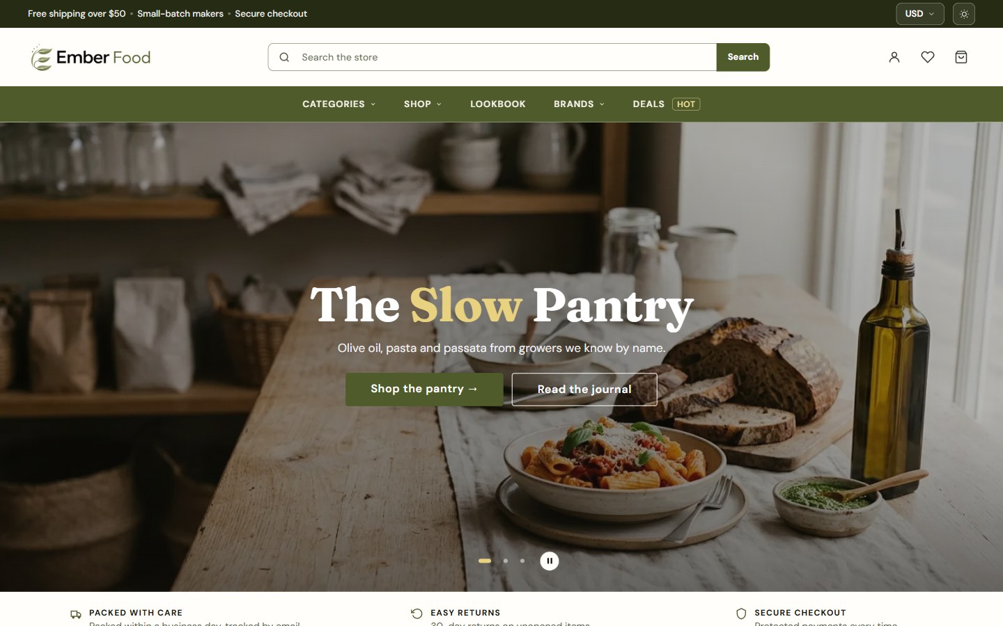
Ember Food variation homepage — Market layout with a search-first header, terracotta navigation band and a pantry hero

Food — Market layout

A fine-food deli: a search-first header, a terracotta navigation band, round category tiles, product shelves, recipe stories and a makers’ wall. Fraunces over DM Sans on a warm cream ground, with a dark mode in brick and terracotta.

Food & BeverageRecipe storiesMakers’ wall
View the Food demo →
Everything built in

Merchandising features, native to the theme.

Grouped by where they matter: navigation, the homepage, the product page, the cart and the look of your brand. Each one is configurable from Theme Styles and Page Builder.

Ember storefront in light and dark mode side by side, switched with the header toggle

Dark Mode

A shopper-facing light / dark toggle in the header. Dark Mode Colors are their own editable colour group, and each variation sets its own default mode.

  • Toggle
  • Own palette
  • Per-variation default
The Classic, Editorial and Market layout presets of Ember shown side by side

Three Layout Presets

Classic, Editorial and Market change the header, hero, cards and grid — not just the colours. Switch presets in Theme Styles.

  • Classic
  • Editorial
  • Market
Ember Lookbook scene with a product hotspot linked to the matching product cards

Lookbook

Shop-the-look scenes with product hotspots: shoppers tap a point on the photo to see the product and add it to the cart.

  • Hotspots
  • Shop the look
  • Own page
Ember mega menu open with category columns and a promo image, next to the mobile menu

Mega Navigation

Category and brand panels with promo images on desktop, a multi-tiered sidebar menu, and a slide-out menu on phones.

  • Mega menu
  • Brand panel
  • Mobile menu
Ember homepage sections: hero carousel, Flash Sale countdown, newsletter, testimonials and brand story

Homepage Sections

Hero carousel (built from Storefront > Carousel slides or Page Builder), Flash Sale with countdown, testimonials, newsletter, brand story and press bar — each toggled in Theme Styles.

  • Hero
  • Flash Sale
  • Testimonials
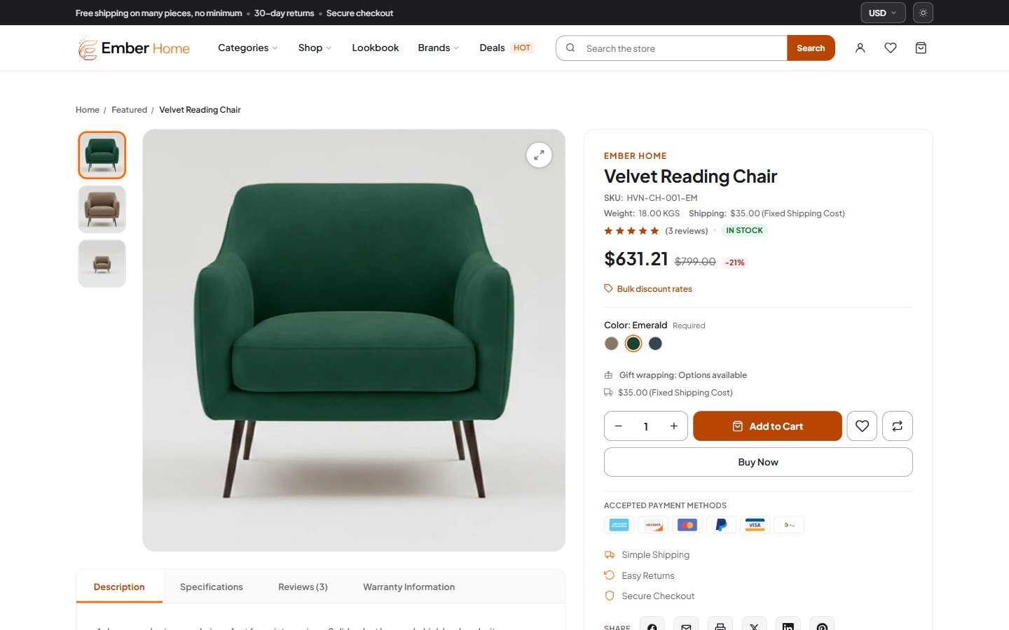
Ember product page with image gallery, product video, Q&A tab and sticky add to cart

Product Page

Sticky add to cart, a high-resolution image gallery, product videos, a Q&A tab, compare and recently viewed products.

  • Sticky ATC
  • Video
  • Q&A tab

Demo video: “Dining Table Design” by DH interiors, CC BY.

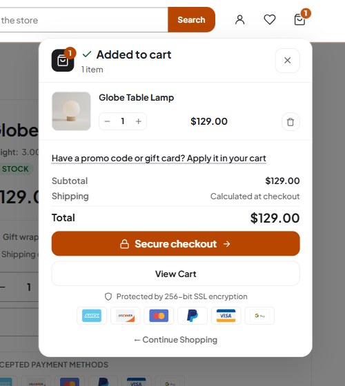
Ember slide-out cart sheet with a free-shipping progress bar, opened on add to cart

Cart Sheet

Quick add to cart and quick view on product cards, then a slide-out cart sheet with a free-shipping progress bar. The cart persists between visits.

  • Quick add
  • Quick view
  • Free-shipping bar
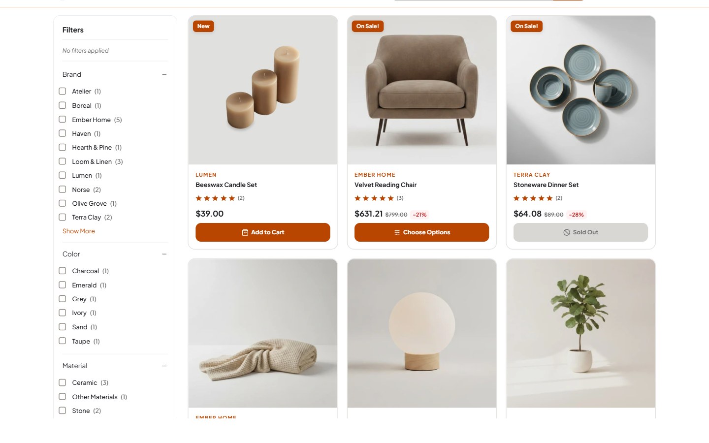
Ember category page with a filters sidebar, grid / list toggle, product comparison table and mobile filter drawer

Browse & Filter

Faceted search and filtering on category, brand and search pages, a mobile filter drawer, switchable grid / list view and a product comparison table.

  • Faceted filters
  • Grid / list
  • Compare
Ember brand colours and fonts set in Theme Styles, shown on three storefronts and a styled checkout

Your Brand, Everywhere

Every brand colour is a Theme Styles setting in both modes, previewed live in Page Builder and carried into BigCommerce’s checkout.

  • Live preview
  • Light + dark
  • Styled checkout
See it in action

Real screenshots, real storefronts.

Every screen below is live on the Ember demo stores — nothing mocked up.

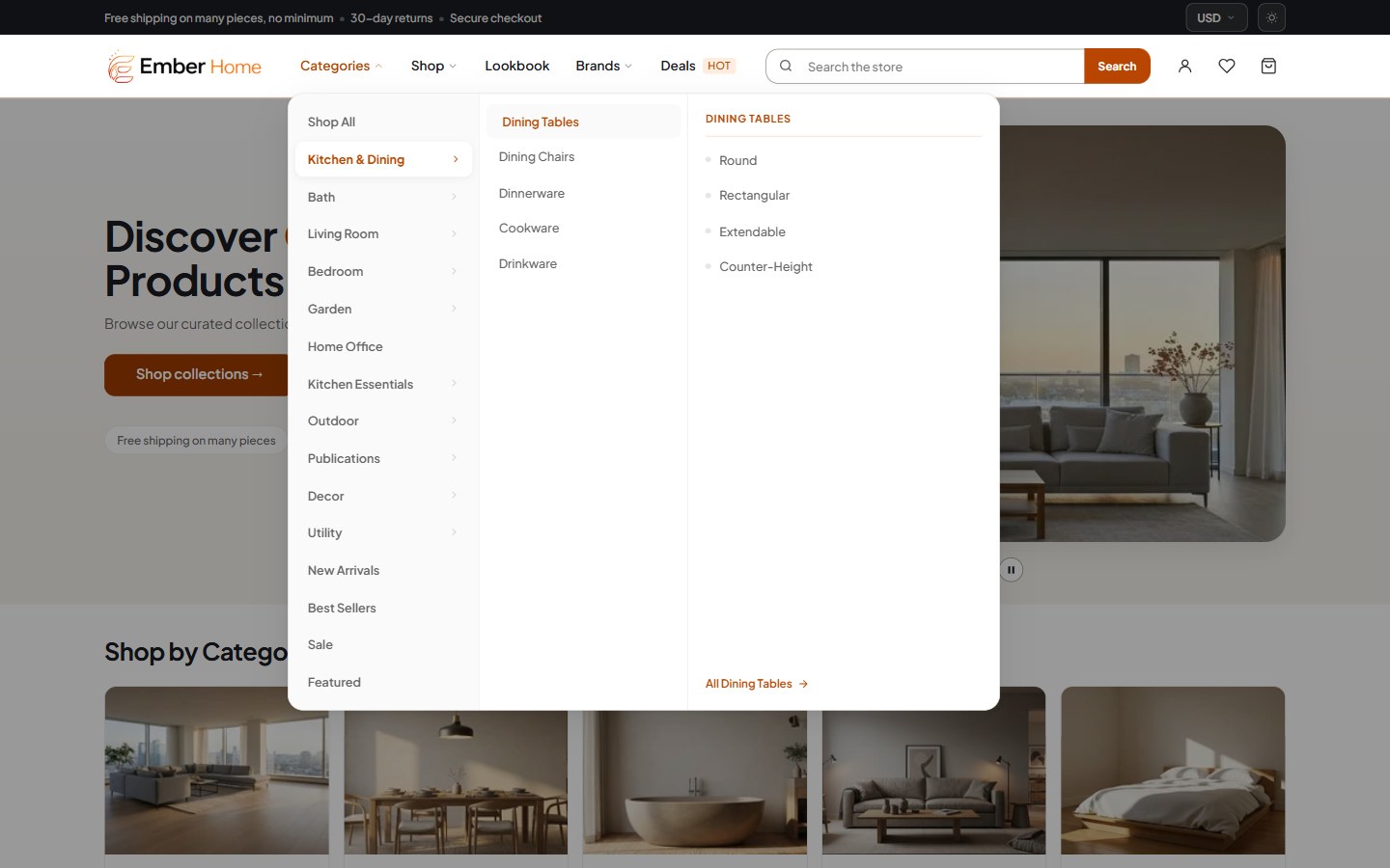
Ember mega menu open on the Home demo, with three levels of categories in side-by-side columns
Navigation

A menu that shows the whole catalog.

The mega menu opens category and brand panels with promo images, so shoppers see the depth of your range before they click.

  • Category and brand panels
  • Promo images inside the menu
  • Slide-out menu on phones
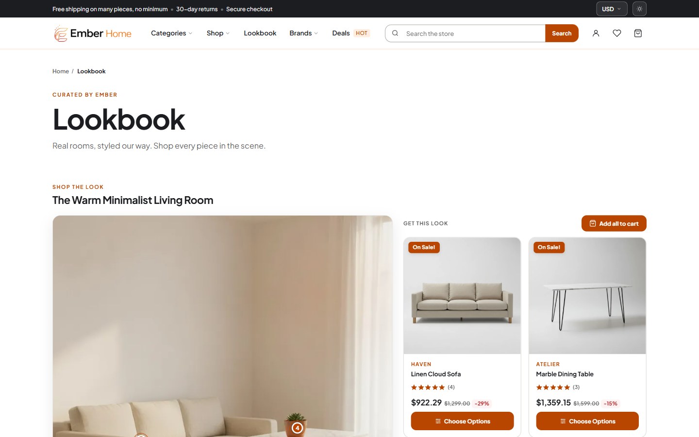
Ember Lookbook page with a styled room scene and product hotspots
Lookbook

Sell the look, not just the item.

Lookbook scenes put product hotspots on your own photography, so a styled room or outfit becomes a shopping list.

  • Product hotspots on any scene
  • Product details on tap
  • A page of its own in the menu
Ember product page with image gallery, options and add to cart
Product page

Everything a shopper needs to decide.

A high-resolution gallery with product videos, tabs for description, specifications, reviews and Q&A, and a sticky add to cart that follows the scroll.

  • Sticky add to cart
  • Q&A tab and product videos
  • Compare and recently viewed
Ember slide-out cart sheet with a free-shipping progress bar and line items with quantity controls
Cart

A cart that keeps shoppers on the page.

Add to cart from a card or the product page and the drawer slides in, with a progress bar toward free shipping.

  • Slide-out cart sheet
  • Free-shipping progress bar
  • Persistent cart
Ember category page with faceted filters in the sidebar and a product grid
Browse & filter

Find products fast, on any catalog.

Faceted filters on category, brand and search pages, a filter drawer on phones, and grid or list view.

  • Faceted search and filtering
  • Mobile filter drawer
  • Switchable grid / list view
Homepage sections

Merchandising blocks, switched on in Theme Styles.

Ember Flash Sale homepage section with a countdown timer above discounted products
Flash Sale — a countdown above the products on offer.
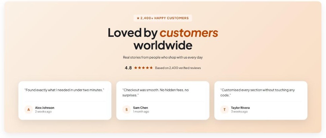
Ember testimonials homepage section with customer quotes
Testimonials — demo content
Make it yours

400+ settings. Zero code.

Brand colours, dark-mode colours, fonts, layout preset and every homepage section live in Theme Styles — change them in Page Builder and watch the preview update.

150+Colour controls
60+Select options
40+On/off toggles
9Font pickers
AaAaAa
Built to perform

Fast by default, accessible by design.

Ember ships clean, semantic markup and responsive images, and its contrast is measured in every variation and both colour modes — so every shopper can buy.

  • WCAG 2.1 AA contrast in every variation, light and dark
  • One h1 per page, labelled controls, visible focus
  • No horizontal scroll on any page down to 320px
  • Responsive images with WebP and srcset, lazy-loaded page scripts
AAContrast, both modes
320pxNo horizontal scroll
WebPResponsive images
1h1 per page
Cornerstone·Stencil Utils 6.19.0·Webpack 5·Babel 7·jQuery 3·GraphQL Storefront API·lazysizes· Cornerstone·Stencil Utils 6.19.0·Webpack 5·Babel 7·jQuery 3·GraphQL Storefront API·lazysizes·
The full list

Every feature, in one place.

Native to the theme and configurable from Theme Styles and Page Builder.

Look & layout

  • 3 variations: Home, Fashion, Food
  • 3 layout presets: Classic, Editorial, Market
  • Shopper-facing dark mode toggle
  • Dark Mode Colors group
  • Every brand colour in Theme Styles

Navigation

  • Mega navigation with promo images
  • Category and brand panels
  • Multi-tiered sidebar menu
  • Slide-out mobile menu
  • Currency selector

Homepage

  • Hero carousel from Storefront > Carousel slides
  • Flash Sale with countdown
  • Testimonials
  • Newsletter
  • Brand story & press bar
  • Product showcase sections

Product page

  • High-res image gallery
  • Product videos
  • Sticky add to cart
  • Q&A tab
  • Recently viewed products
  • Customizable product selector

Cart & checkout

  • Quick add to cart
  • Advanced quick view
  • Slide-out cart sheet
  • Free-shipping progress bar
  • Persistent cart
  • Customized one-page checkout

Browse & filter

  • Faceted search & filtering
  • Mobile filter drawer
  • Switchable grid / list view
  • Product comparison table

Content

  • Lookbook with product hotspots
  • Blog
  • About and FAQ page templates

Account & security

  • Wishlist
  • Account payment methods v2
  • CSRF protection
  • Enhanced ecommerce analytics

Foundation

  • Fully responsive (mobile / tablet / desktop)
  • WCAG 2.1 AA contrast, both modes
  • Built on Cornerstone
  • 400+ Theme Styles settings
  • Free customer support
  • Free theme upgrades

Three stores in one theme. Pick yours.

Get Ember with all three variations, free updates and friendly support from the PapaThemes team.

3 variations, 3 demo stores Free theme upgrades Documentation included Free customer support

Related Products

Did you know?

Free Trial for all our BigCommerce themes.

Request Now

Need help? Don't hesitate to ask us. We'll reply shortly.

All our BigCommerce themes are 100% compatible with the Standard, Pro, Enterpise edition. Built with Stencil / Cornerstone framework.