

Install the app on your BigCommerce store.
Go to BigCommerce Apps Marketplace, find Product Part Diagram app and install it on your store.
After installed, the app will appear in your BigCommerce admin dashboard > Apps.
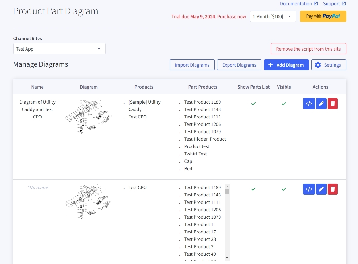
Create Diagram
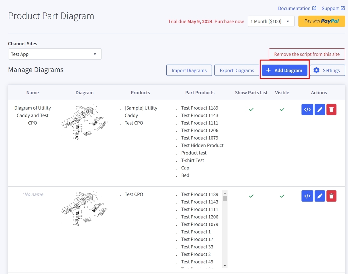
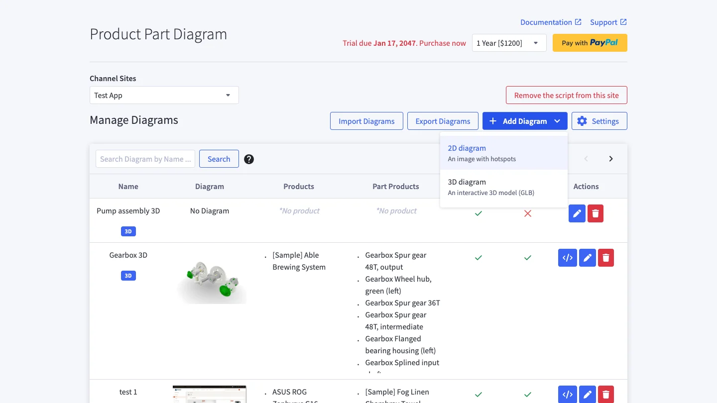
Go back to the app, click Add Diagram button to create Diagram for products. The button opens a menu: choose 2D diagram for an image diagram (below) or 3D diagram for an interactive 3D model (see 3D Diagrams).
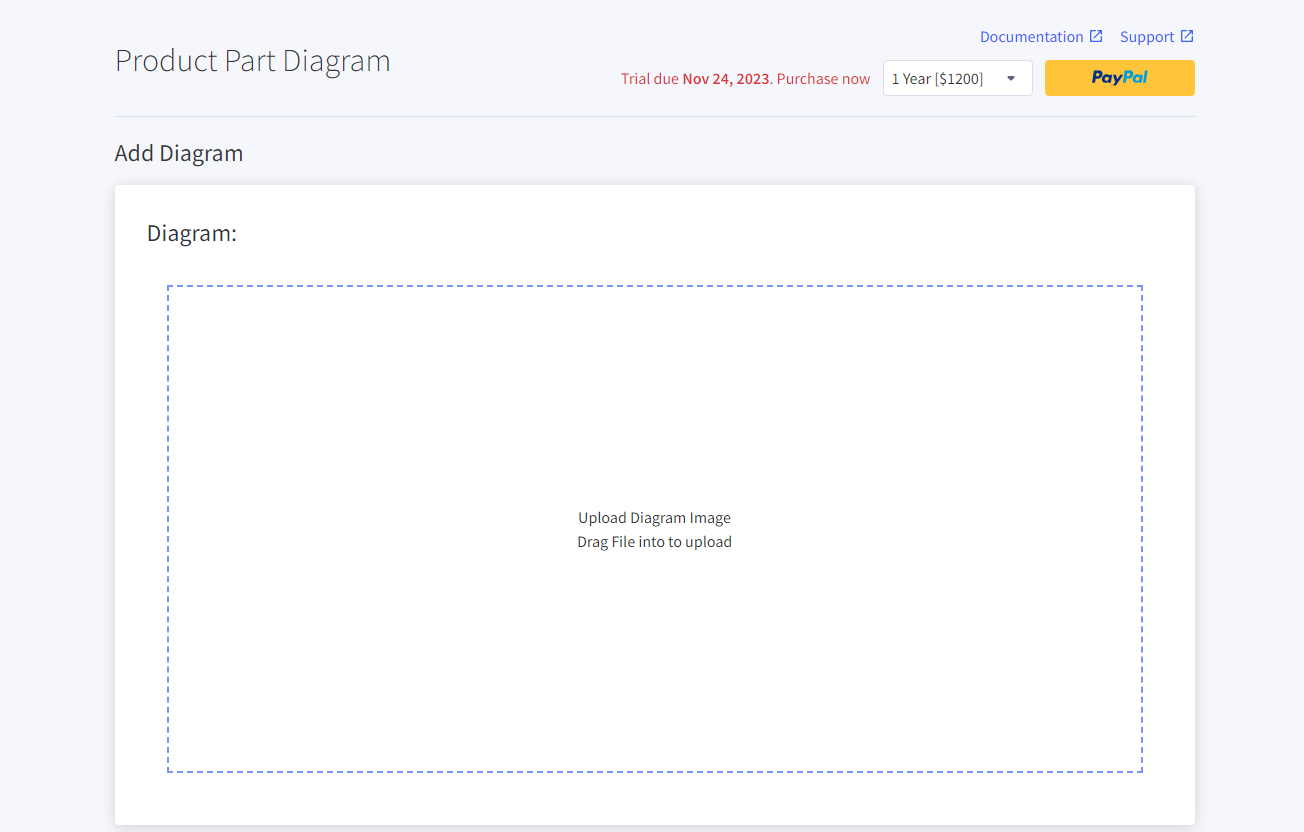
Upload your diagram image:
Change your diagram name at "Diagram name" input. "Diagram name" will be displayed in the diagram tag on the client side.

Select products you want display diagram:

You can also do bulk select product by using import and export.
Click on Export to export the current product list or template if there are no product have been selected.
Paste your product and product ID to the export file (exportProductAssigns).
Click on Import and import edited file.
Adding product to table part list:
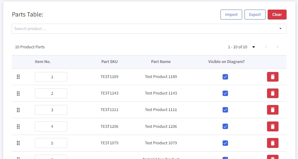
You can use do bulk update for your product list by using Import and Export.
Click on Export to export your current product list or export the template file if there are no product in the list.
Open CSV file and input your product or edit your current product.
Click on Import to import edited file.
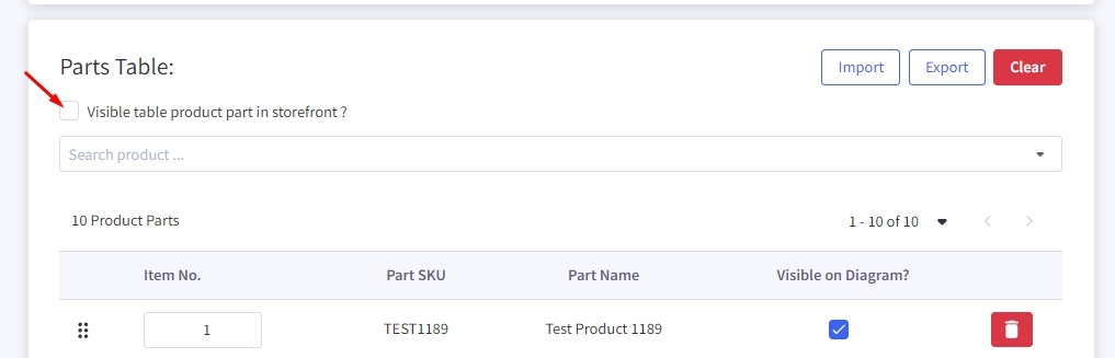
You can hide or display part table on your store front by check/uncheck on option Visible table product part in storefront?
After you have selected the "Product Parts" list, you can add them into the diagram.
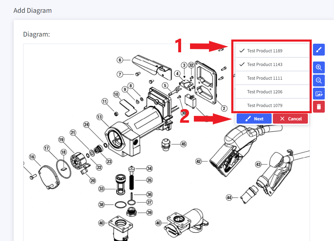
Click on the "Add Polygon" button.
Select the list of "Product Parts", that will be displayed in the polygon. (1)
Click on the "Next" button to proceed with drawing the polygon. (2)
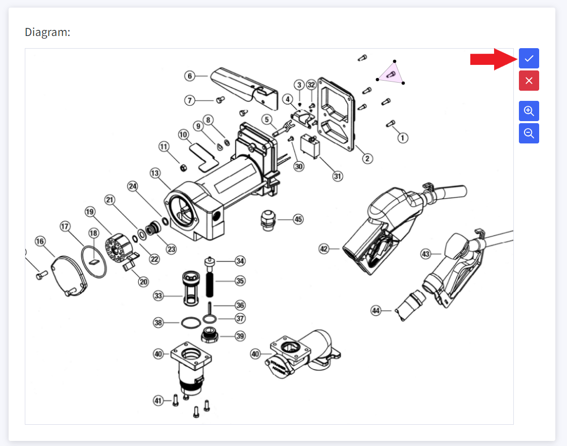
Next, you can draw the polygon by clicking on points within the diagram.
Note, you must click on three or more points to form a polygon.
After you have finished drawing the polygon, click on the "Finish drawing" button to end the drawing process.
Click on the "Save" button to save the setup Diagram.
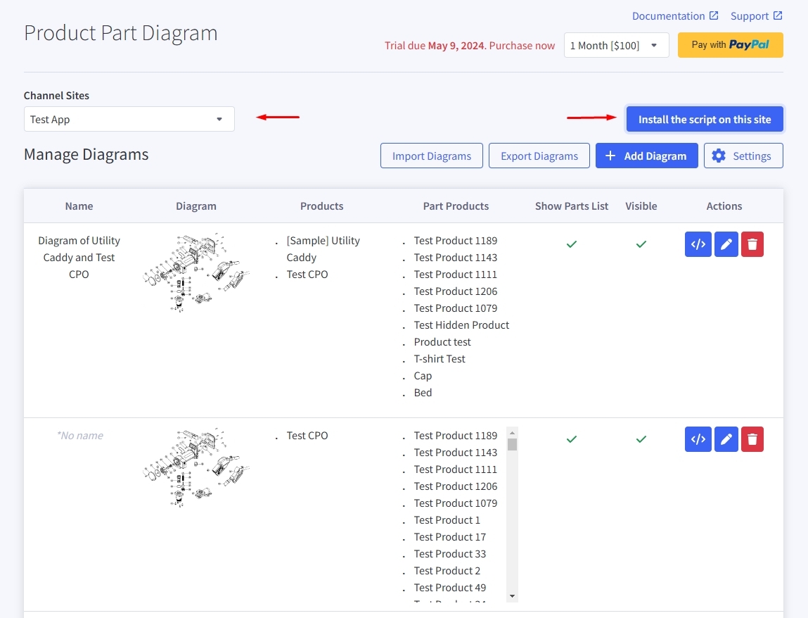
Finally, select channel you want to apply the diagram and click on "install the script on this site"
Setting
-
Sometimes, the App may not be able to display the Diagram, or the Diagram may display incorrectly on the client.
-
The reason is that depending on the "Current Theme" being applied, some themes have a slightly different structure which can cause the Diagram to display incorrectly.
-
Therefore, we have created a Settings function, allowing you to restructure the display position, as well as support fixing errors related to displaying Diagrams at the Client.
-
By default, the Settings should work well with all Themes, but for some special Themes, you can adjust the Settings so that the Diagram can be displayed correctly according to your Theme.
Open the Settings interface
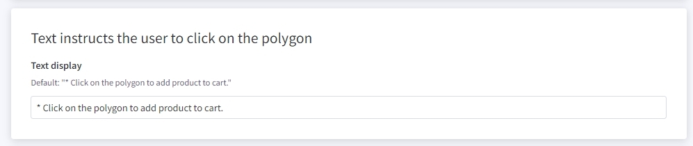
Open the 'Product Part Diagrams' app, click on the 'Settings' button.
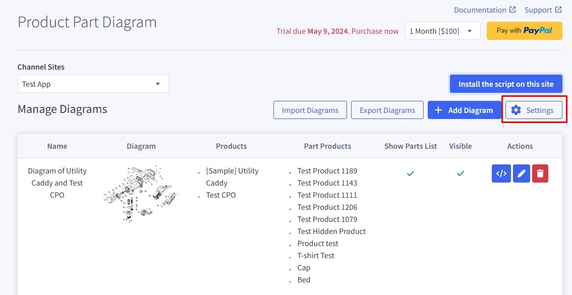
“Location the diagram on the product detail page in the store” Setting
This setting will change the position of the Diagram display on product detail page.
There are three options:
-
Above "description section" (Above "element selector")
-
In a new tab, same row as description tab
-
Below "description section" (At the end of "element selector")
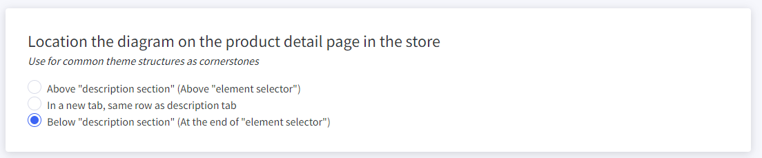
"Text instructs the user to click on the polygon"
- To change the text when hover on polygon, in advance setting navigate to Text instructs the user to click on the polygon change the text in input field below. If you want to remove the text simply leave the input field in blank.
Change part table layout.
-
Part table layout can be change to Pagination, Scroll and show all
- In Pagination mode you can change number product display per page by typing number product that you want.
-
In Scroll mode you can adjust the height of window display product by typing the height that you want.
Display diagram to any webpage
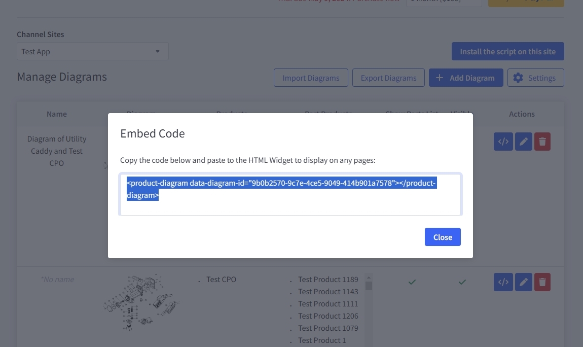
To display a product part diagram on your webpage, just click on the embed code icon of the diagram you wish to display
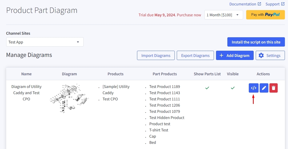
A popup will appear you just need to copy the script in the popup and paste it to HTML widget.
Advanced Settings
-
These are advanced settings, used to define Selectors, adjust Diagram spacing, color settings, and so on.
-
If you have knowledge of CSS Selectors or equivalent, customizing these settings will be easier.
-
You can open/close the advanced settings by toggling the 'Show advanced settings' option.
-
Please note, if your Diagram is already displaying well on the client and there's no need for advanced customization, you don't need to make these adjustments.
3D Diagrams
A 3D diagram shows your product as an interactive 3D model instead of a flat image. Shoppers can rotate it, zoom in, pull the assembly apart, and click any part to see the matching product — then add the parts they need to the cart in one step. You build it in the app from a .glb model exported from your CAD or 3D software; no coding is needed.
What you need
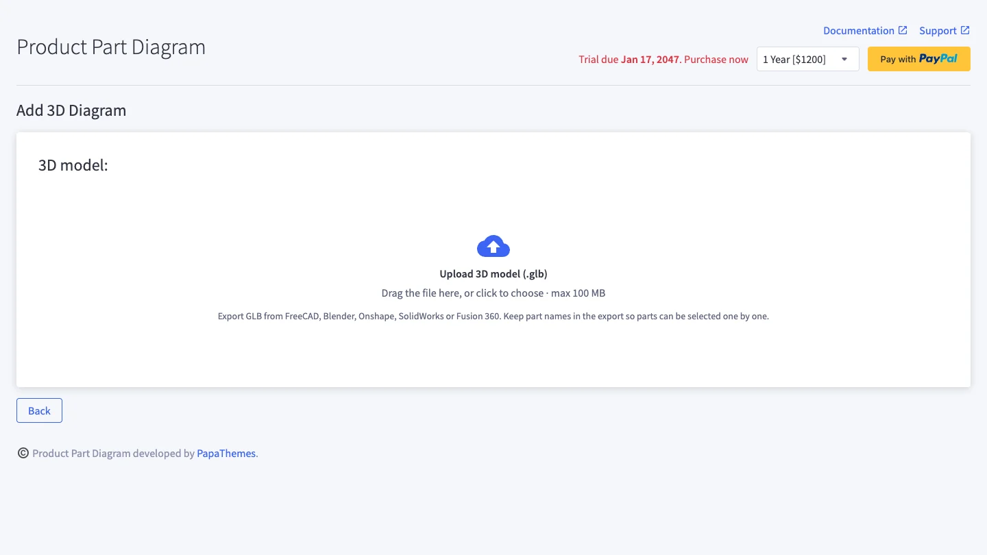
- A 3D model in GLB format (glTF binary, up to 100 MB). FreeCAD, Blender, Onshape, SolidWorks and Fusion 360 can all export GLB. Keep the part names in the export: every named piece becomes a node you can select.
- The products shoppers will buy for each part, already in your BigCommerce catalog and visible on your storefront channel.
- The latest app version. 3D diagrams are available on every store. If “3D diagram” is missing from the Add Diagram menu, reload the app; if it is still missing, contact support.
Step 1 — Create a 3D diagram
- Open the app and go to Manage Diagrams.
- Click Add Diagram and choose 3D diagram (choose 2D diagram for a classic image with hotspots).
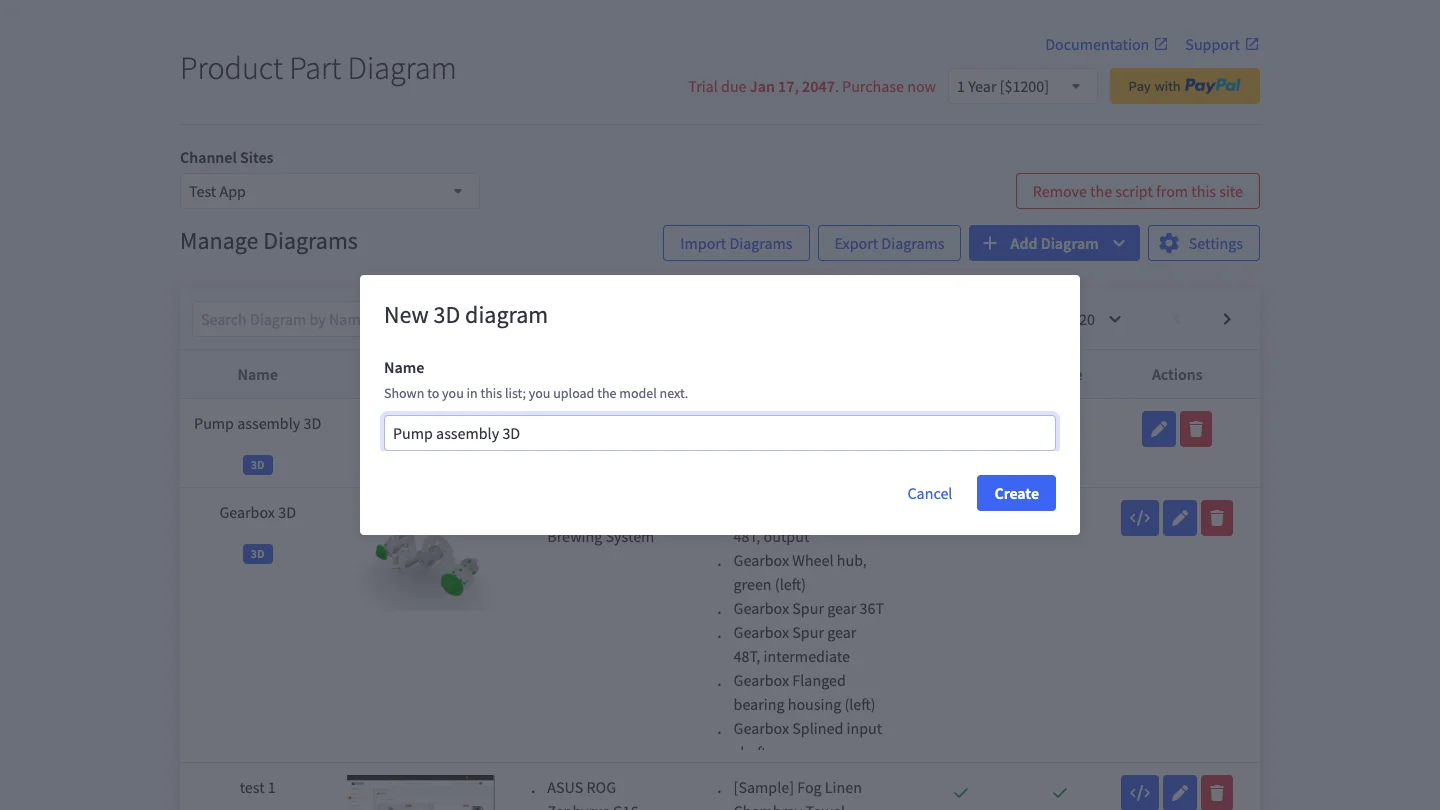
- Enter a name and click Create.
Step 2 — Upload the model
Drag your .glb file onto the upload area, or click it to choose the file.
The app prepares the model in your browser before uploading it: it checks the file, compresses the geometry and textures, and renders a poster image. The screen shows the original and optimised file size, the number of triangles and parts. When it finishes, the editor opens.
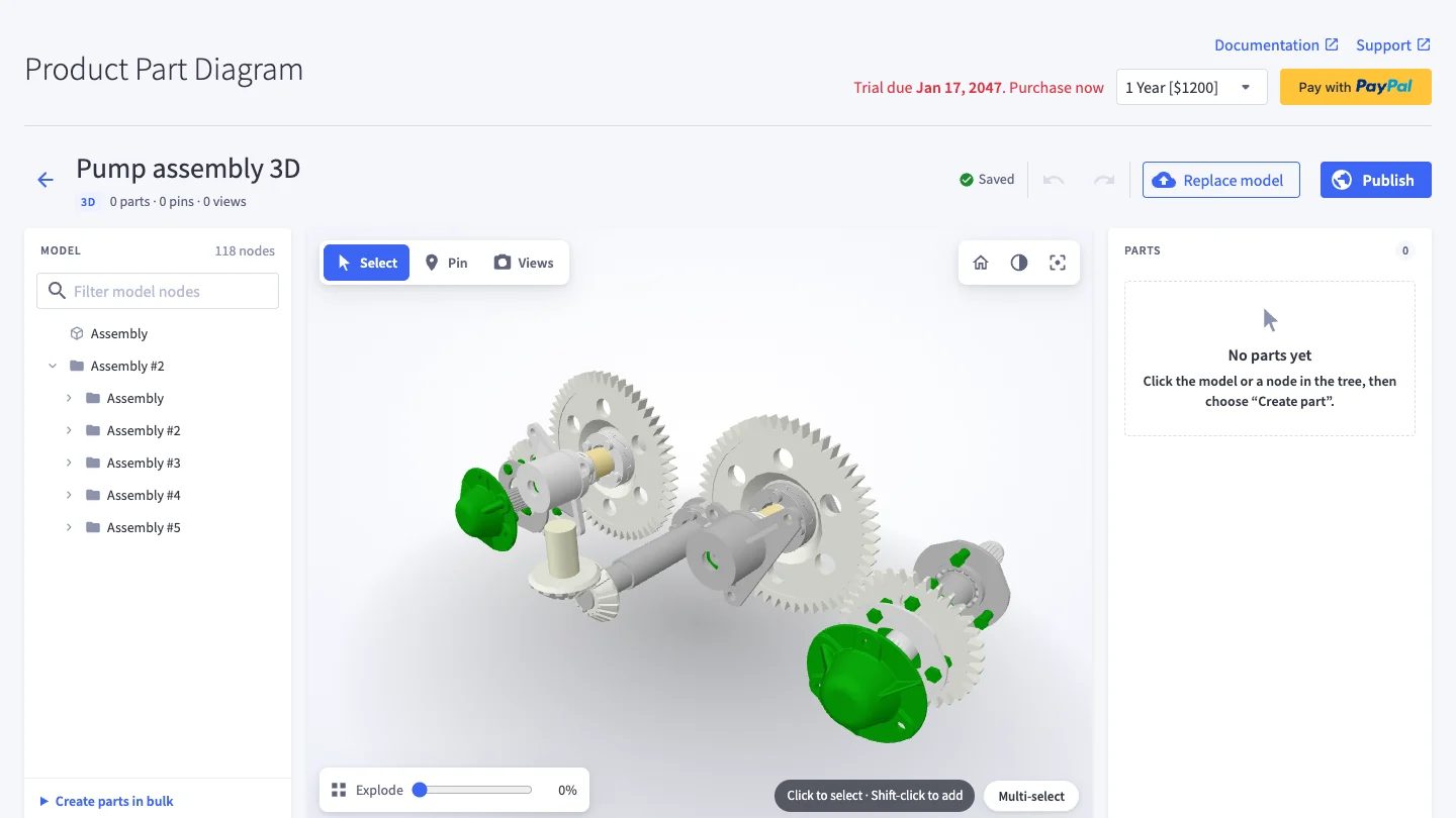
Tip: keep models lean. Very heavy models (roughly more than 1.5 million triangles on computers, 500,000 on phones, counting every repeated part) are shown to shoppers as the poster image with the parts list instead of the 3D view.
Step 3 — Get to know the editor
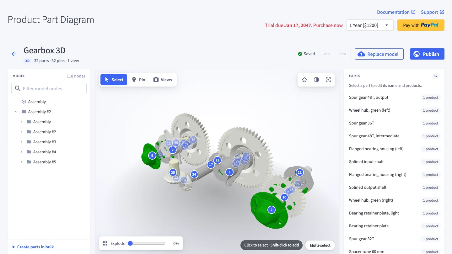
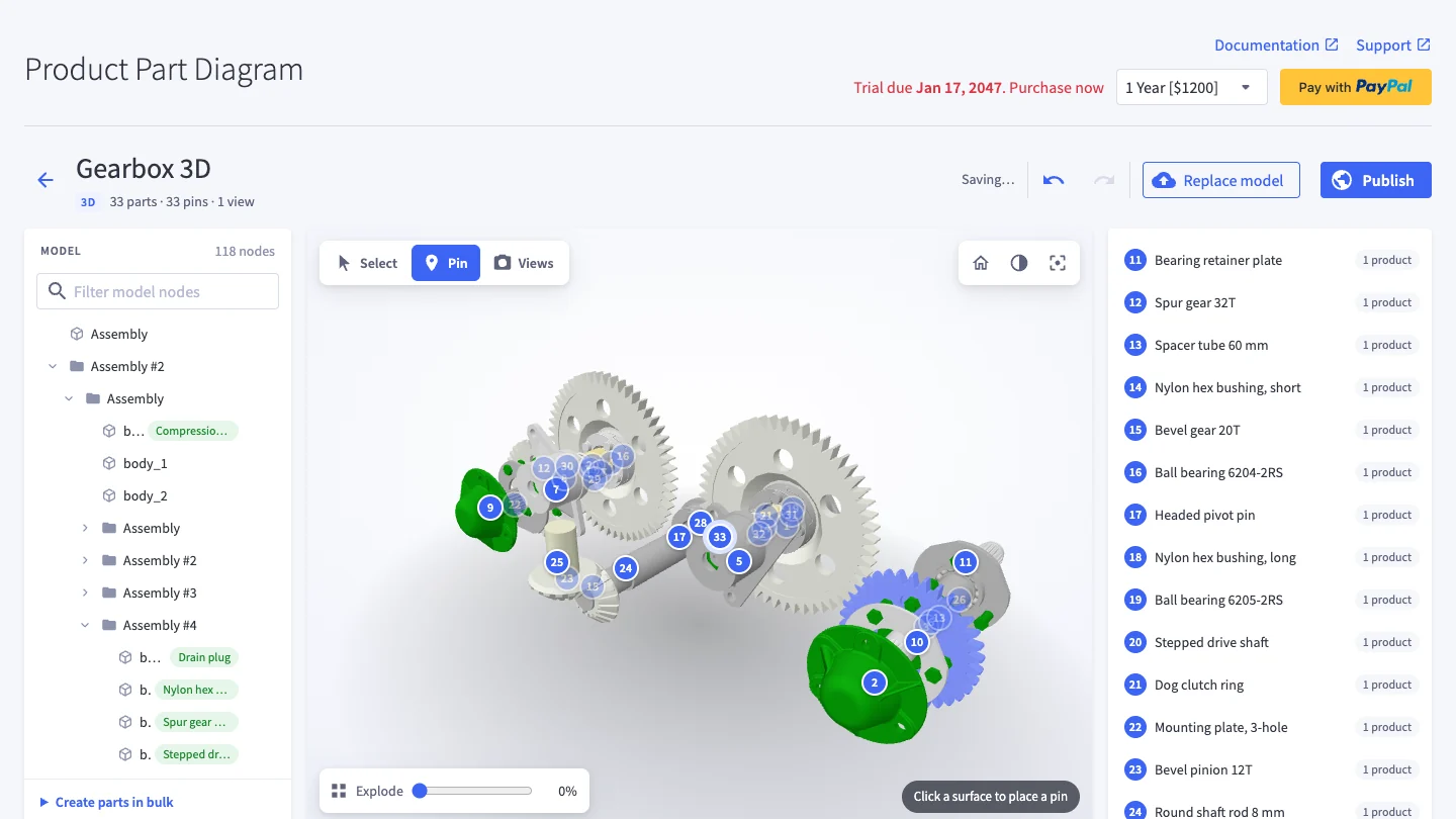
- Left — Model tree: every piece of the assembly, grouped the way it was modelled.
- Centre — 3D view: the model exactly as shoppers will see it. Drag to rotate, right-drag to pan, scroll to zoom. The house button resets the view.
- Right — Parts and inspector: the parts you have created and the settings of whatever is selected.
- Top: the diagram name (click to rename), save status, Undo / Redo, Replace model and Publish. Every change is saved automatically.
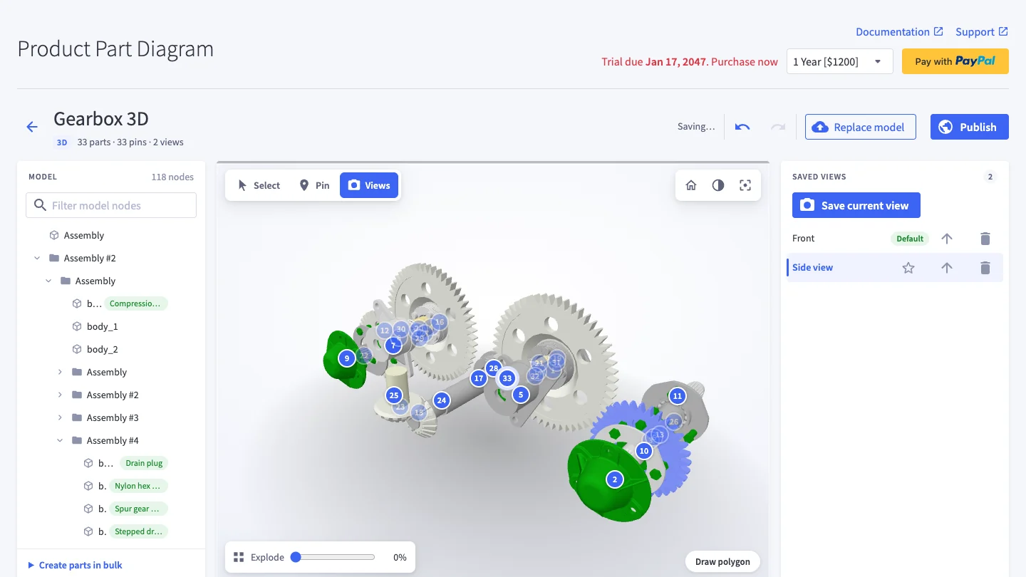
- Modes: Select (parts), Pin (numbered pins) and Views (saved camera angles).
Model tree
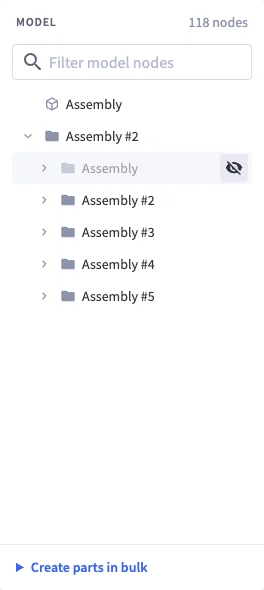
- Type in Filter model nodes to find pieces by name.
- Use the arrows to open and close assemblies. Keyboard: arrow keys move, Enter selects.
- Hover a row and click the eye icon (or press H) to hide a piece while you work — handy to reach parts inside a housing. Hidden pieces are only hidden in the editor; they are not saved into views and shoppers always see them.
Step 4 — Create parts and link products
A part is something shoppers can buy. It groups one or more pieces of the model and links them to one or more products.
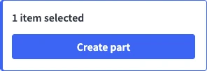
- Click a piece in the 3D view or in the tree. Shift-click (or turn on Multi-select) to add more pieces.
- In the selection card on the right, click Create part and give it a name. If a part is already selected, Add to “…” adds the pieces to it instead.
- Under Products, tick the products this part shows. Add products to the list in the Parts Table section below the editor.
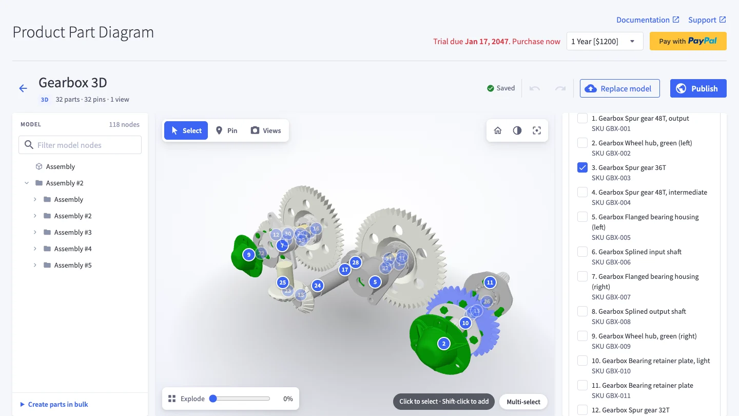
Part tools in the inspector: Show part (zooms to it), Isolate (shows only this part), Delete, and Explode direction. To create many parts at once, open Create parts in bulk under the tree: every assembly at the chosen level becomes a part, and product SKUs in piece names are matched automatically.
X-ray and Highlight parts
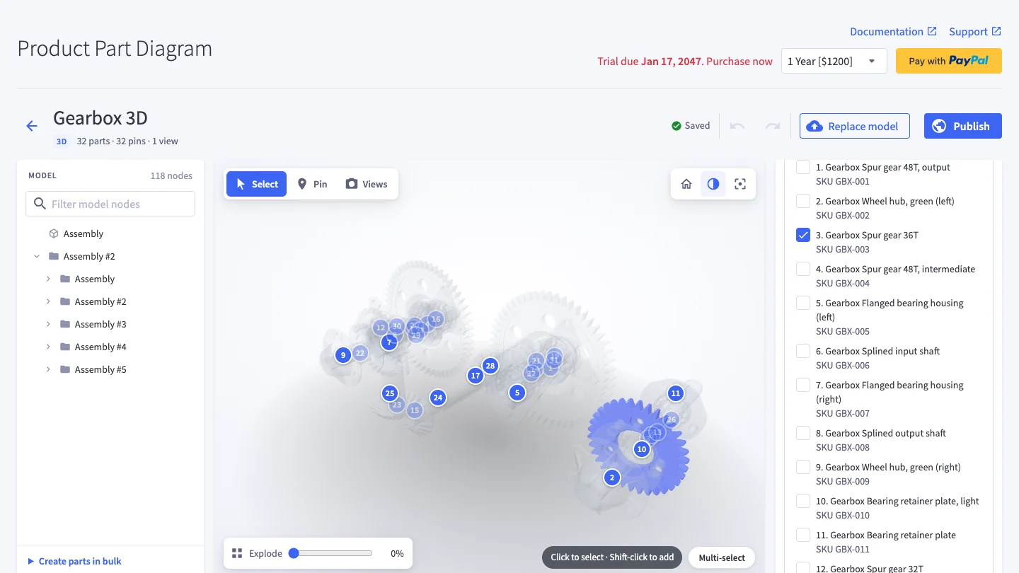
- X-ray (half-circle button) makes everything except the selection see-through, so the selected part is easy to see from any angle.
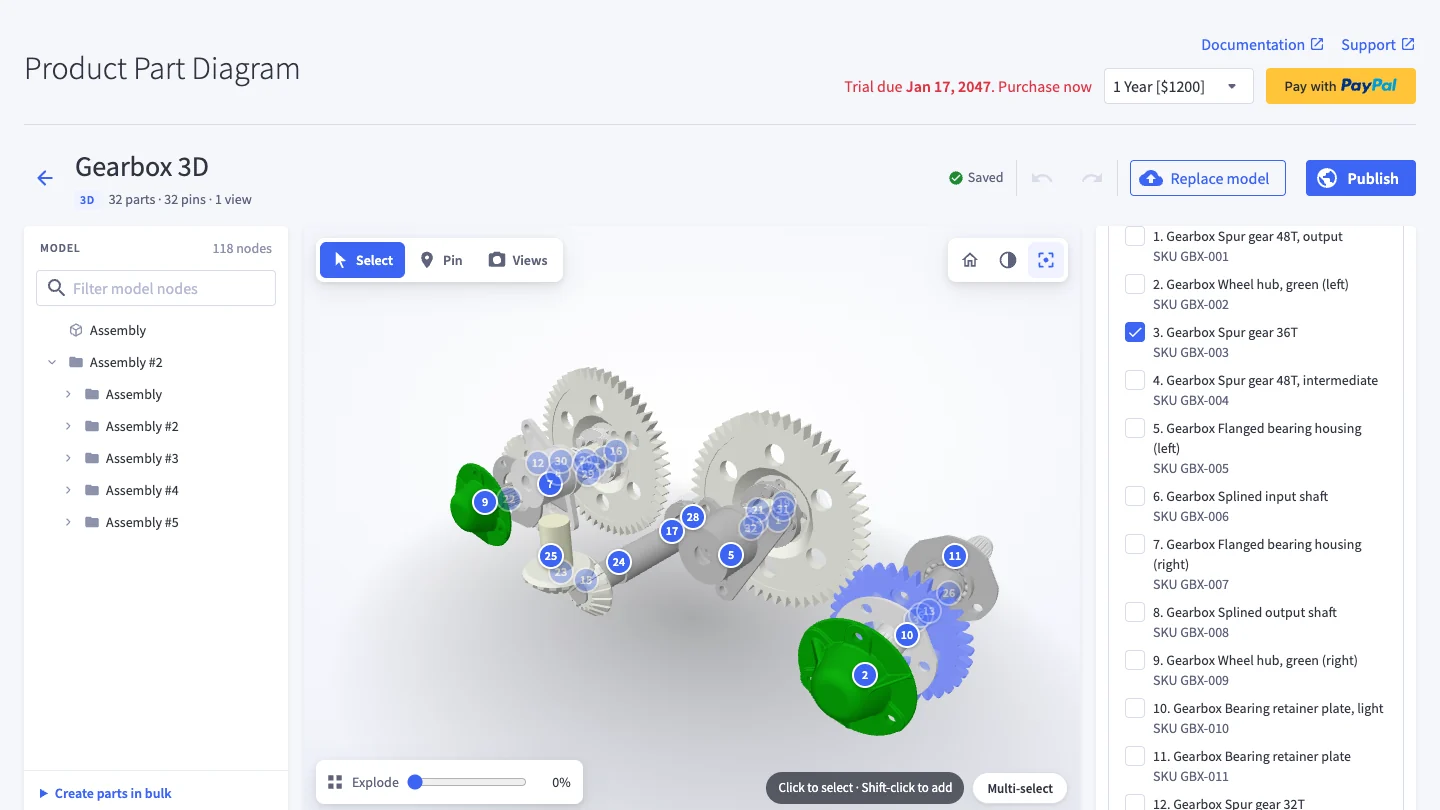
- Highlight parts (focus button) fades every piece that is not in a part yet — a quick check of what still needs a product.
Step 5 — Explode, pins and saved views
Explode
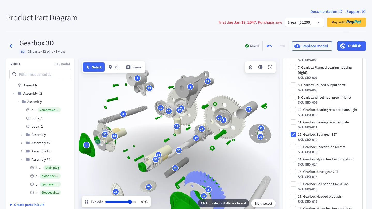
Drag Explode at the bottom of the 3D view to pull the assembly apart. Shoppers get the same slider. If a part flies the wrong way, set its Explode direction in the inspector.
Pins
Switch to Pin and click the model to drop a numbered pin. Select a pin to give it a label and link products. Pins stay attached when the model rotates or explodes, and grow or shrink with the zoom.
Saved views
Switch to Views, frame a camera angle (and an explode amount) and click Save current view. Shoppers get a button for each view. Inside a view you can also Draw polygon to make a clickable area linked to products. Star a view to make it the one shoppers see first.
Step 6 — Publish
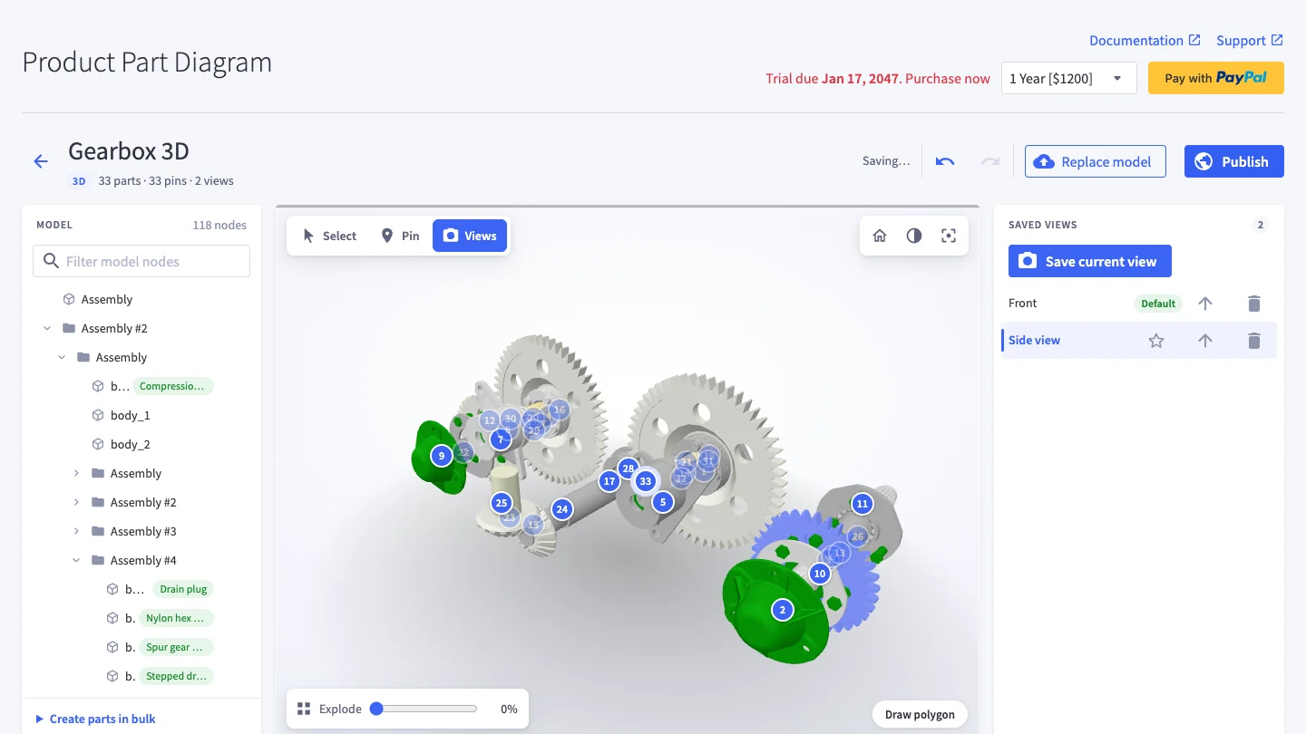
Click Publish. The app checks the diagram first (for example, parts without products) and then sends it to your storefront. Shoppers see the new version within about 5 minutes. You can keep editing: changes stay in your draft until you publish again.
Then assign the diagram to the products whose pages should show it, under Assign diagram to products below the editor — the same as for 2D diagrams.
Replacing the model
Click Replace model to upload a new version of the file. Parts, pins and views are matched to the new model automatically; anything that could not be matched is listed for you to review. Click Mark as reviewed, then publish.
What shoppers see
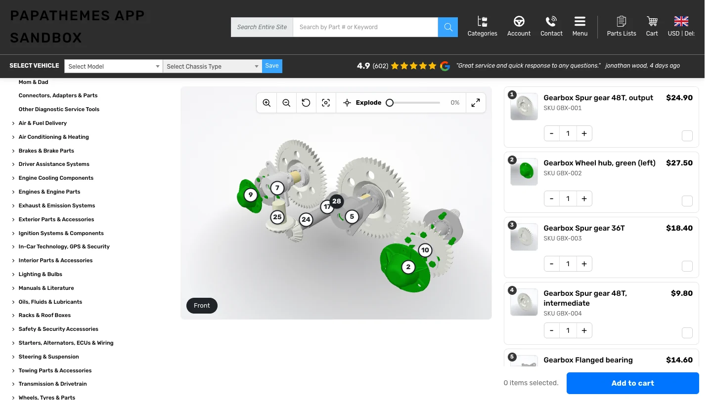
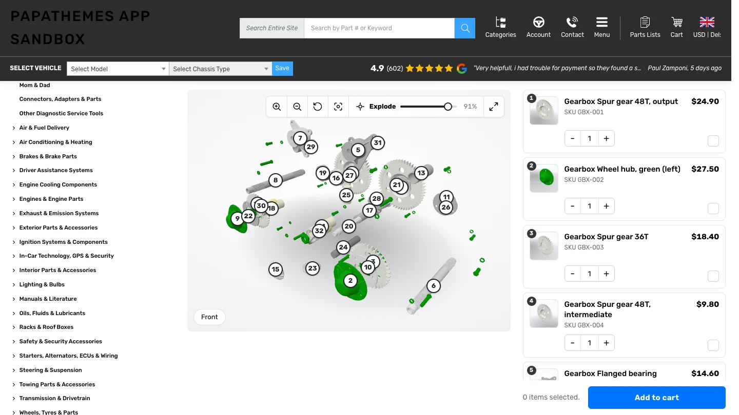
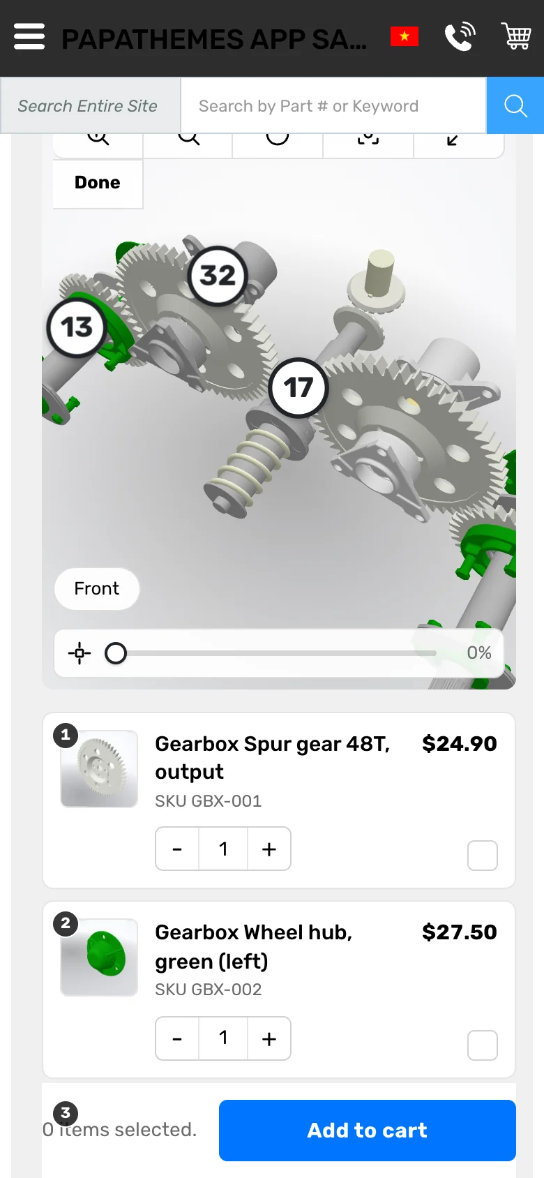
- Rotate and zoom: drag the model, scroll or use the + / − buttons; the reset button returns to the start.
- Explode: the slider pulls the assembly apart.
- Highlight parts: fades everything that is not for sale; clicks go through the faded pieces to the parts inside.
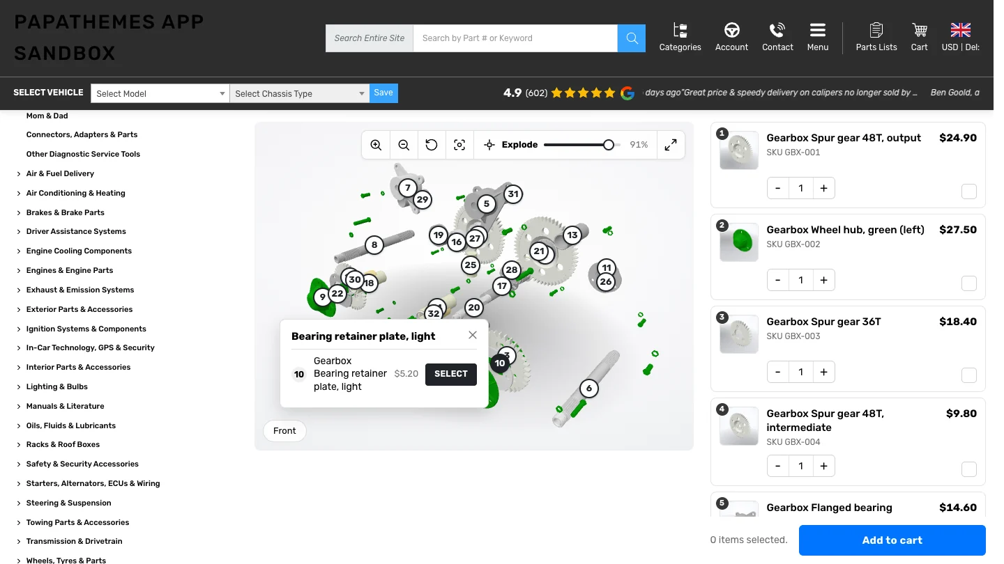
- Parts and pins: clicking a part or a numbered pin opens a popup with the product, its price and a Select / Options button.
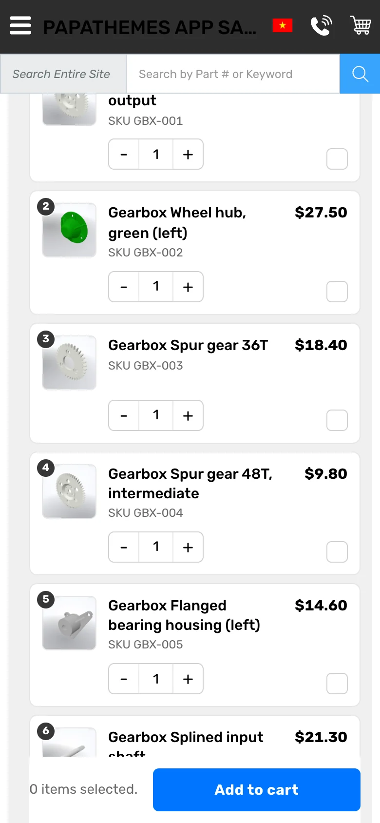
- Linked parts list: selecting in 3D highlights the row, and clicking a row selects the part in 3D.
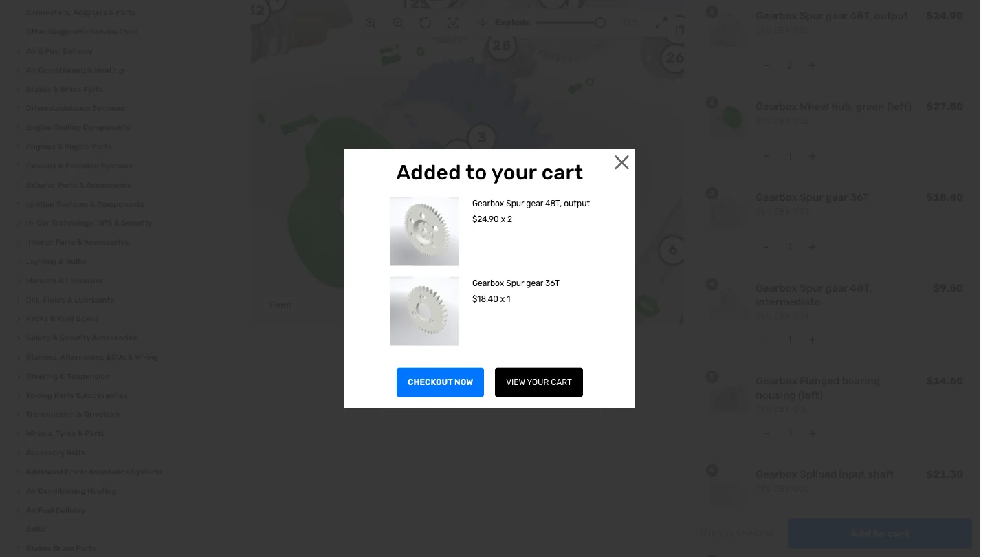
- Add to cart: set quantities, tick the parts and click Add to cart to add them all at once.
- Full screen: for a closer look; Esc returns to the page.
On phones
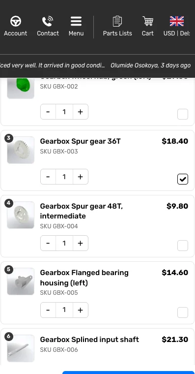
The page scrolls normally until the shopper taps View in 3D / Tap to interact; then one finger rotates and two fingers zoom. Done hands scrolling back to the page. The parts list becomes one card per part with the image, name, price, quantity and select box.
Good to know
- “3D view is not available on this device”: the shopper’s browser cannot show the 3D model (no WebGL 2, a blocked script, or a model heavier than the device limit). The poster image and the full parts list are shown instead, so they can still buy.
- Changes not showing on the storefront: publishing takes up to about 5 minutes to reach shoppers. Check that the diagram is Visible and assigned to the product.
- Prices in the parts list follow your store’s tax display setting, the same as your product pages.
- Import / Export Diagrams work for 2D diagrams. 3D diagrams are listed in the import preview but are not imported (the model files stay with the store they were made in).
- The storefront widget uses your theme’s fonts and colours; the 3D toolbar colour can be changed with the CSS variable
--pd3d-accent.
Support
For any problem, please contact us for support.