
Building Reusable Section Components with AI: A Developer's Guide
Every BigCommerce developer has been there: you build a beautiful feature grid for one client, then the next client needs something similar. Do you copy-paste the old code and hope for the best? Start from scratch and waste hours? Maintain a messy folder of "components" that are never quite right?
There's a better way. By combining AI-powered generation with proper component architecture, you can build a library of truly reusable sections that work across projects, themes, and brands.
This guide shows you how to create maintainable, scalable components that save time without sacrificing quality. Whether you're building your first component library or improving an existing one, these patterns will make your code cleaner and your workflow faster.
The Copy-Paste Problem
Most BigCommerce developers maintain some form of component library, even if it's just a folder of "sections I've built before." The problem? These components rarely work out of the box when you need them.
Here's what typically happens:
- You copy code from a previous project
- The colors are hardcoded, so you find-and-replace 47 instances of
#3b82f6 - The breakpoints don't match your new theme
- The class names conflict with existing styles
- Two hours later, you've essentially rebuilt it from scratch
The root cause: Components built for a specific project, not for reuse. They're tightly coupled to brand colors, spacing systems, and naming conventions that don't transfer.
The solution isn't to build more generic components. It's to build components that are designed for customization from the start.
 Left: Hardcoded values that break when reused. Right: CSS custom properties make theming effortless.
What Makes a Component Truly Reusable
Before we look at AI generation, let's define what makes a component actually reusable across projects:
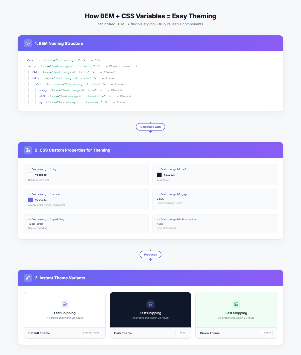
1. CSS Custom Properties for Theming
Instead of hardcoding colors, spacing, and typography, expose them as CSS variables:
.feature-grid {
    --feature-grid-bg: #ffffff;
    --feature-grid-color: #111827;
    --feature-grid-accent: #6366f1;
    --feature-grid-gap: 2rem;
    --feature-grid-padding: 4rem 2rem;
}
Now theme changes are as simple as redefining a few variables:
/* Brand A: Blue theme */
.brand-a .feature-grid {
    --feature-grid-accent: #2563eb;
}

/* Brand B: Green theme */
.brand-b .feature-grid {
    --feature-grid-accent: #059669;
}
2. BEM Naming for Predictable Structure
BEM (Block Element Modifier) ensures class names never conflict and structure is always clear:
<div class="feature-grid">
    <div class="feature-grid__container">
        <h2 class="feature-grid__title">Why Choose Us</h2>
        <div class="feature-grid__items">
            <div class="feature-grid__item">
                <div class="feature-grid__icon">...</div>
                <h3 class="feature-grid__item-title">Fast Shipping</h3>
                <p class="feature-grid__item-text">Orders ship within 24 hours</p>
            </div>
        </div>
    </div>
</div>
Benefits:
- No naming conflicts across components
- Structure is self-documenting
- Easy to find related styles
- Safe to modify without breaking other components
3. Semantic HTML with Proper ARIA
Components should be accessible by default:
<section class="feature-grid" aria-labelledby="features-title">
    <div class="feature-grid__container">
        <h2 id="features-title" class="feature-grid__title">Why Choose Us</h2>
        <div class="feature-grid__items" role="list">
            <article class="feature-grid__item" role="listitem">
                <img src="..." alt="Fast shipping icon" class="feature-grid__icon">
                <h3 class="feature-grid__item-title">Fast Shipping</h3>
                <p class="feature-grid__item-text">Orders ship within 24 hours</p>
            </article>
        </div>
    </div>
</section>
4. Responsive Design with Consistent Breakpoints
Define breakpoints as variables and use them consistently:
.feature-grid__items {
    display: grid;
    grid-template-columns: 1fr;
    gap: var(--feature-grid-gap);
}

@media (min-width: 768px) {
    .feature-grid__items {
        grid-template-columns: repeat(2, 1fr);
    }
}

@media (min-width: 1024px) {
    .feature-grid__items {
        grid-template-columns: repeat(3, 1fr);
    }
}
Step-by-Step: Building a Reusable Feature Grid with AI
Let's build a feature grid component from scratch using AI, but with reusability built in from the start.
Step 1: Write a Detailed Prompt
The key to getting reusable code from AI is being specific about architecture requirements. Don't just describe what you want it to look like—describe how you want it to be structured.
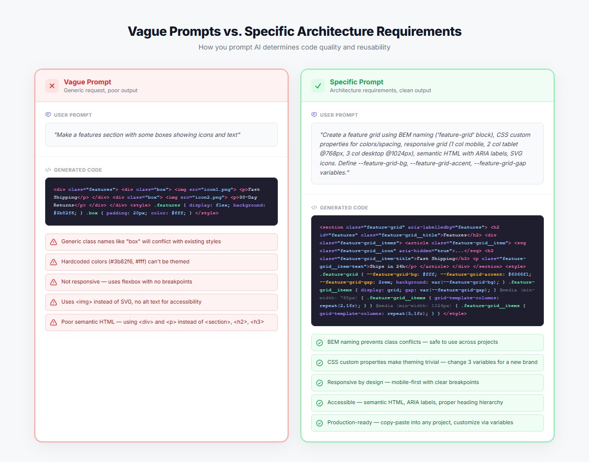 Specific prompts that include architecture requirements produce production-ready, reusable components.
Bad prompt:
Make a features section with some boxes showing icons and text
Good prompt:
Create a responsive feature grid section with:

STRUCTURE:
- BEM naming convention with "feature-grid" as the block
- Semantic HTML5 with proper ARIA labels
- 3-column grid on desktop, 2 columns on tablet, 1 column on mobile

STYLING:
- Use CSS custom properties for colors, spacing, and typography
- Define these variables: --feature-grid-bg, --feature-grid-color, --feature-grid-accent, --feature-grid-gap
- Mobile breakpoint: 768px, Desktop breakpoint: 1024px

FEATURES:
- Icon at the top (40px size)
- Heading below icon
- Description text below heading
- Subtle hover effect (scale and shadow)

ACCESSIBILITY:
- Proper heading hierarchy (h2 for section, h3 for items)
- Alt text for icons
- ARIA labels for the section and list
Step 2: Generate and Review the Code
The AI will generate code that looks something like this:
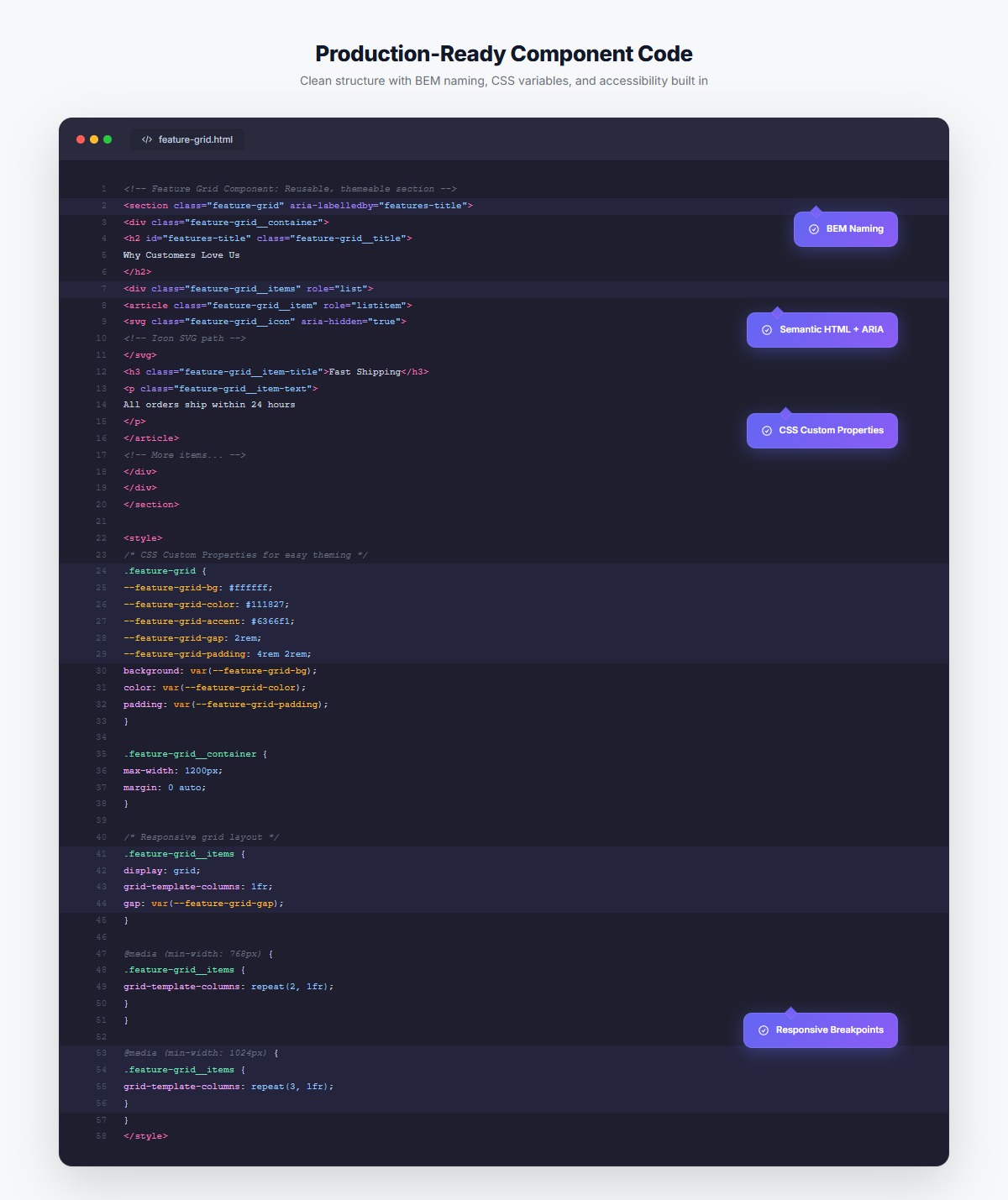
<section class="feature-grid" aria-labelledby="feature-grid-title">
    <div class="feature-grid__container">
        <h2 id="feature-grid-title" class="feature-grid__title">Why Customers Love Us</h2>
        <div class="feature-grid__items" role="list">
            <article class="feature-grid__item" role="listitem">
                <svg class="feature-grid__icon" aria-hidden="true">
                    <!-- Icon SVG -->
                </svg>
                <h3 class="feature-grid__item-title">Fast Shipping</h3>
                <p class="feature-grid__item-text">Free delivery on orders over $50. Most orders ship within 24 hours.</p>
            </article>
            <!-- More items... -->
        </div>
    </div>
</section>
.feature-grid {
    /* CSS Custom Properties for easy theming */
    --feature-grid-bg: #ffffff;
    --feature-grid-color: #111827;
    --feature-grid-accent: #6366f1;
    --feature-grid-gap: 2rem;
    --feature-grid-padding: 4rem 2rem;
    --feature-grid-icon-size: 40px;

    background: var(--feature-grid-bg);
    color: var(--feature-grid-color);
    padding: var(--feature-grid-padding);
}

.feature-grid__container {
    max-width: 1200px;
    margin: 0 auto;
}

.feature-grid__title {
    font-size: 2.5rem;
    font-weight: 700;
    text-align: center;
    margin-bottom: 3rem;
    color: var(--feature-grid-color);
}

.feature-grid__items {
    display: grid;
    grid-template-columns: 1fr;
    gap: var(--feature-grid-gap);
}

.feature-grid__item {
    background: #fff;
    border: 1px solid #e5e7eb;
    border-radius: 12px;
    padding: 2rem;
    text-align: center;
    transition: transform 0.2s, box-shadow 0.2s;
}

.feature-grid__item:hover {
    transform: translateY(-4px);
    box-shadow: 0 12px 24px rgba(0, 0, 0, 0.1);
}

.feature-grid__icon {
    width: var(--feature-grid-icon-size);
    height: var(--feature-grid-icon-size);
    color: var(--feature-grid-accent);
    margin: 0 auto 1.5rem;
}

.feature-grid__item-title {
    font-size: 1.25rem;
    font-weight: 600;
    margin-bottom: 0.75rem;
    color: var(--feature-grid-color);
}

.feature-grid__item-text {
    font-size: 0.95rem;
    line-height: 1.6;
    color: #6b7280;
}

/* Responsive breakpoints */
@media (min-width: 768px) {
    .feature-grid__items {
        grid-template-columns: repeat(2, 1fr);
    }
}

@media (min-width: 1024px) {
    .feature-grid__items {
        grid-template-columns: repeat(3, 1fr);
    }

    .feature-grid__title {
        font-size: 3rem;
    }
}
Step 3: Test Across Contexts
Before adding this to your library, test it:
- Different content lengths - Does it handle 3 words vs. 50 words gracefully?
- Multiple themes - Try redefining the CSS variables with different colors
- Various screen sizes - Check mobile, tablet, desktop, and large desktop
- Accessibility - Run it through axe DevTools or similar
Creating Component Variants with CSS Custom Properties
Once you have a base component, creating variants is trivial. Here's a dark theme variant:
.feature-grid--dark {
    --feature-grid-bg: #0f172a;
    --feature-grid-color: #ffffff;
    --feature-grid-accent: #818cf8;
}

.feature-grid--dark .feature-grid__item {
    background: #1e293b;
    border-color: #334155;
}

.feature-grid--dark .feature-grid__item-text {
    color: #cbd5e1;
}
Usage:
<section class="feature-grid feature-grid--dark">
    <!-- Same HTML structure -->
</section>
Other variants to consider:
feature-grid--compact(reduced padding and gap)feature-grid--large(bigger icons and text)feature-grid--card-style(more prominent cards with shadows)feature-grid--horizontal(icons on the left instead of top)

Building Your Component Library: 6 Essential Sections
Every BigCommerce store needs these six core section types. Build them once with reusability in mind, and you'll never start from scratch again:
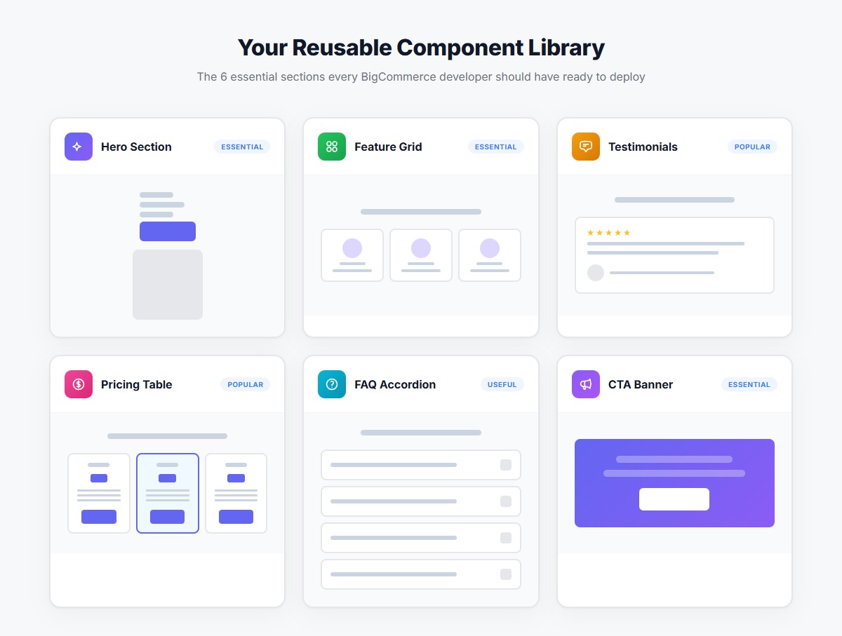 The six essential components every BigCommerce developer should have in their library
1. Hero Section
Core elements:
- Headline, subheadline, CTA button
- Optional: background image, secondary CTA
- Variants: left-aligned, centered, image-right, full-background
CSS variables to expose:
--hero-bg
--hero-color
--hero-accent
--hero-padding
--hero-title-size
--hero-button-bg
--hero-button-color
AI prompt template:
Create a hero section with BEM naming ("hero" block), responsive design (mobile/tablet/desktop breakpoints at 768px/1024px), CSS custom properties for theming, and proper semantic HTML with ARIA labels.
2. Feature Grid
(We built this above—add it to your library)
3. Testimonial Carousel
Core elements:
- Customer quote, name, photo, rating
- Navigation arrows and dots
- Variants: single, 2-column, 3-column
CSS variables to expose:
--testimonial-bg
--testimonial-color
--testimonial-card-bg
--testimonial-rating-color
--testimonial-gap
4. Pricing Table
Core elements:
- Plan name, price, feature list, CTA button
- Optional: "Popular" badge, annual/monthly toggle
- Variants: 2-column, 3-column, 4-column
CSS variables to expose:
--pricing-bg
--pricing-card-bg
--pricing-accent
--pricing-border-color
--pricing-popular-badge-bg
5. FAQ Accordion
Core elements:
- Question, answer, expand/collapse icon
- Smooth transitions
- Variants: minimal, boxed, two-column
CSS variables to expose:
--faq-bg
--faq-color
--faq-border-color
--faq-hover-bg
--faq-icon-color
6. CTA Banner
Core elements:
- Headline, description, CTA button
- Optional: background image, secondary text
- Variants: full-width, contained, split-layout
CSS variables to expose:
--cta-bg
--cta-color
--cta-button-bg
--cta-button-color
--cta-padding
Tips for Better AI Prompts
After building dozens of reusable components with AI, here are the prompting patterns that consistently produce better results:
1. Start with Architecture Requirements
Always include in your prompt:
- "Use BEM naming convention with '[block-name]' as the block"
- "Use CSS custom properties for all colors, spacing, and typography"
- "Responsive design with breakpoints at 768px (tablet) and 1024px (desktop)"
- "Semantic HTML5 with proper ARIA labels"
2. Be Specific About Breakpoints
Instead of: "Make it responsive"
Say: "Mobile (up to 767px): single column. Tablet (768px-1023px): 2 columns. Desktop (1024px+): 3 columns."
3. List the CSS Variables You Want
Instead of: "Make colors customizable"
Say: "Define these CSS custom properties: --component-bg, --component-color, --component-accent, --component-border"
4. Request Examples of Usage
Add to your prompt: "Include an example of how to create a dark theme variant using CSS custom properties"
5. Specify Accessibility Requirements
Include: "Add proper ARIA labels, ensure keyboard navigation works, use semantic HTML with correct heading hierarchy"
 Clean, well-structured component code following best practices
Real-World Example: Multi-Brand Store
Here's where reusable components really shine. Let's say you're building BigCommerce stores for three brands under the same parent company:
Brand A: Tech startup (blue/purple, modern, bold) Brand B: Eco-friendly products (green, earthy, warm) Brand C: Luxury goods (gold/black, elegant, refined)
With traditional development, you'd build similar sections three times. With reusable components, you build once and theme three times:
/* Brand A: Tech Startup */
.brand-a .feature-grid {
    --feature-grid-bg: #f8fafc;
    --feature-grid-color: #0f172a;
    --feature-grid-accent: #6366f1;
    --feature-grid-gap: 2rem;
}

/* Brand B: Eco-Friendly */
.brand-b .feature-grid {
    --feature-grid-bg: #f0fdf4;
    --feature-grid-color: #14532d;
    --feature-grid-accent: #059669;
    --feature-grid-gap: 1.5rem;
}

/* Brand C: Luxury */
.brand-c .feature-grid {
    --feature-grid-bg: #0c0a09;
    --feature-grid-color: #fafaf9;
    --feature-grid-accent: #fbbf24;
    --feature-grid-gap: 3rem;
}
Same HTML structure, same component logic, but three completely different visual treatments. This is the power of proper component architecture.
Time saved:
- Traditional approach: 3 sections × 8 hours each = 24 hours
- Reusable approach: 1 section (12 hours) + 3 themes (2 hours each) = 18 hours
- Savings: 25% on the first project, 75% on every subsequent project
Common Mistakes to Avoid
1. Over-Abstracting Too Early
Don't try to make every component work for every possible use case. Build for your actual needs, then gradually make it more flexible as you encounter new requirements.
Bad: A "mega-component" with 50 configuration options that's impossible to understand
Good: A solid base component with 3-5 well-chosen variants
2. Forgetting to Document
Future you (or your teammates) won't remember how to use these components. Add comments:
/**
 * Feature Grid Component
 *
 * Usage: <section class="feature-grid">...</section>
 * Variants: .feature-grid--dark, .feature-grid--compact
 *
 * CSS Variables:
 * --feature-grid-bg: Background color (default: #ffffff)
 * --feature-grid-accent: Accent color for icons/highlights (default: #6366f1)
 * --feature-grid-gap: Space between items (default: 2rem)
 */
3. Hardcoding Breakpoints
Instead of repeating @media (min-width: 768px) everywhere, define breakpoint variables:
:root {
    --breakpoint-tablet: 768px;
    --breakpoint-desktop: 1024px;
}

@media (min-width: var(--breakpoint-tablet)) {
    /* Styles */
}
4. Ignoring Edge Cases
Test your components with:
- Very short content (2-3 words)
- Very long content (paragraphs)
- Missing images
- Different numbers of items (what if there are 2 items in a 3-column grid?)
Maintaining Your Component Library
Building the library is just the start. Here's how to keep it useful:
1. Version Your Components
When you make breaking changes, increment a version number:
/* v1.0 - Initial release */
.feature-grid { }

/* v1.1 - Added dark variant */
.feature-grid--dark { }

/* v2.0 - Changed grid system (breaking change) */
.feature-grid-v2 { }
2. Keep a Changelog
Document what changed and why:
## Feature Grid Component

### v2.0 (2026-01-15)
- BREAKING: Changed from flexbox to CSS Grid
- Added: 4-column variant for wide screens
- Fixed: Alignment issue on tablet

### v1.1 (2025-12-10)
- Added: Dark theme variant
- Improved: Hover animation performance
3. Create a Living Style Guide
Build a simple HTML page showcasing all your components with all their variants. This makes it easy to:
- Choose the right component for a project
- See how components look together
- Test changes across all components at once
4. Extract Patterns as You Build
Every time you build something new, ask: "Could this be useful again?" If yes, refactor it into a reusable component and add it to your library.
Scaling Beyond the Basics
Once you have a solid library of core components, you can:
1. Build Composite Components
Combine base components to create common page patterns:
<!-- Product landing page pattern -->
<div class="page-pattern-product-landing">
    <section class="hero hero--product"></section>
    <section class="feature-grid feature-grid--compact"></section>
    <section class="testimonial-carousel"></section>
    <section class="cta-banner"></section>
</div>
2. Create Project Templates
Package common component combinations into full page templates:
- Homepage template (hero + features + testimonials + CTA)
- Product page template (product hero + specs + reviews + related products)
- About page template (story hero + team grid + values + CTA)
3. Share Across Teams
If you work with multiple developers, establish conventions:
- Naming patterns everyone follows
- Required CSS variables for every component
- Minimum accessibility standards
- Testing checklist before adding to library
The 80/20 Rule for Component Libraries
Don't try to build every possible component upfront. Focus on the 20% that you'll use 80% of the time:
High-priority (build these first):
- Hero sections (3 variants)
- Feature grids (2 variants)
- CTAs (2 variants)
- Testimonials (1 variant)
- FAQs (1 variant)
- Pricing tables (1 variant)
Lower-priority (build as needed):
- Complex animations
- Interactive calculators
- Custom data visualizations
- Niche industry-specific sections
Start with the essentials, then expand your library based on actual project needs.
From Ad-Hoc to Systematic
The shift from "I'll just build this real quick" to "I'll pull from my component library and customize" is transformative. You're not just saving time—you're building better, more consistent code that's easier to maintain.
The key insights:
Build for reuse from the start - CSS custom properties, BEM naming, and semantic HTML aren't "nice to haves." They're what make components actually reusable.
Let AI handle the boilerplate - Once you know how to prompt for proper architecture, AI can generate 80% of your component code. You focus on the 20% that requires design thinking.
Iterate and improve - Your component library will evolve. That's good. Each project teaches you something new about what makes components flexible.
Document everything - Six months from now, you won't remember how this component works. Your teammates definitely won't. Write it down.
Getting Started Today
You don't need to build an entire library this week. Start small:
- Pick one component you build frequently (probably a hero or feature grid)
- Rebuild it properly using the patterns from this guide
- Use it in your next project and note what you'd improve
- Refine and document it, then add it to your library
- Repeat with the next component
In three months, you'll have a library that saves hours per project. In six months, you'll wonder how you ever built sites without it.
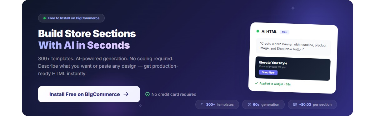
Ready to start building better components? The AI HTML Widget includes 300+ production-ready templates built with these exact patterns. Use them as-is, or study them to see how reusable components are structured.
Install the AI HTML Widget for BigCommerce →
Have questions about building reusable components? Found a pattern that works great for your workflow? Share your experience in the BigCommerce developer community.


